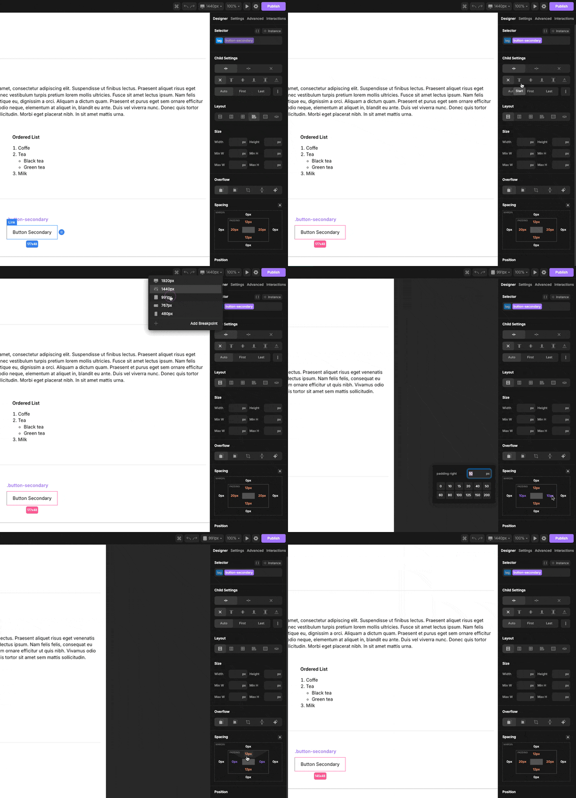
I need some paragraphs to have different padding depending on screen size, but it doesn’t seem to work for me. I remember webflow having this feature, is it the same here?
Hi, have you tried like this?
Yes, it works like this in the builder, but not after it’s published. At least for me.
Thanks
[edit] Seems to be working fine, my layout was messed up.
Hi I am trying to understand the answer but I do not as the gift is too fast and too small. Can you please explain how to assign padding with a class for desktop and assign another class for the padding to tablet only and then another class for padding for mobile. Please help on how to set up these different class. Tried the css direct and does not work @media screen and (min-width: ) and (max-width: ) {self …
Hi @divq if I understand you correctly, you would only need one class to achieve that. You would set your padding on the class by breakpoint/media query. In the builder make certain your class is created and selected. Then select the breakpoint and adjust the padding accordingly.

Thanks for this. I thought you had to create a separate class for each break point.