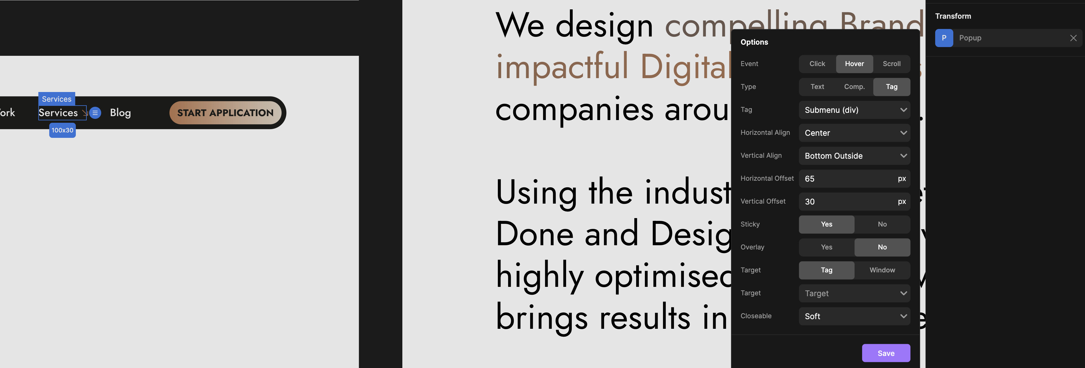
I created a submenu and added horizontal padding, but I’m sure that’s not the best approach. What I wanted to do was align the submenu with the Menu Wrapper instead of the link.
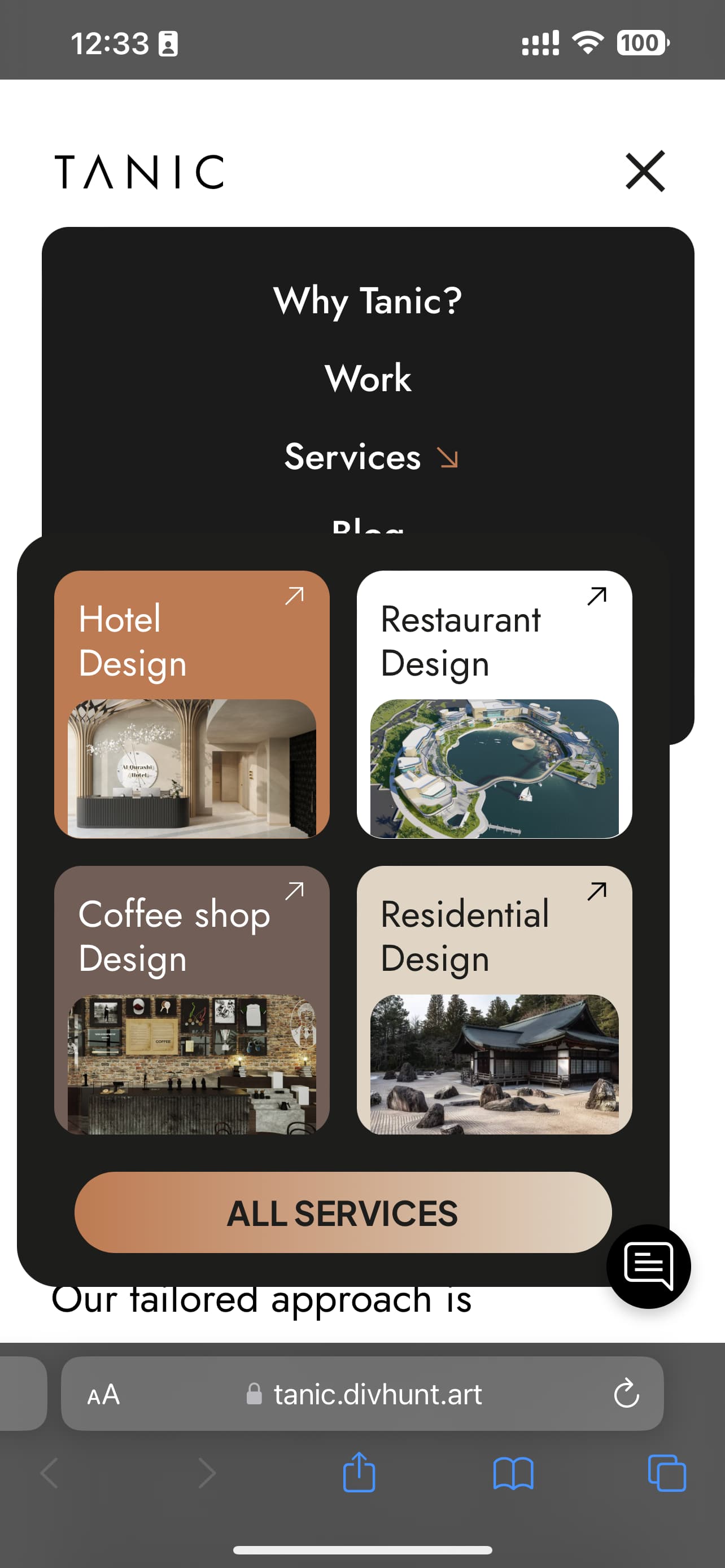
In desktop view, it looks okay. However, in mobile view, it’s not aligned, and when I make changes in the Pop-up tab, it also affects the desktop view.
How can I make sure it’s centered with the Menu Wrapper in both mobile and desktop?
Hey, I guess thats the downside of this plugin, you cant seperately edit options on mobile and on desktop. We need to see whats the best aproach, I will let you know how to fix this
We don’t have a possibility now to edit Transforms undepedently on mobiles and other resolutions, only thing I could have done was to add margin-left to align that a bit better on mobile.
Other solution that would allow you much better customizations is to create navbar that will work only on mobile. So you would have desktop & mobile navbar.
 What I wanted to do was align the submenu with the Menu Wrapper instead of the link.
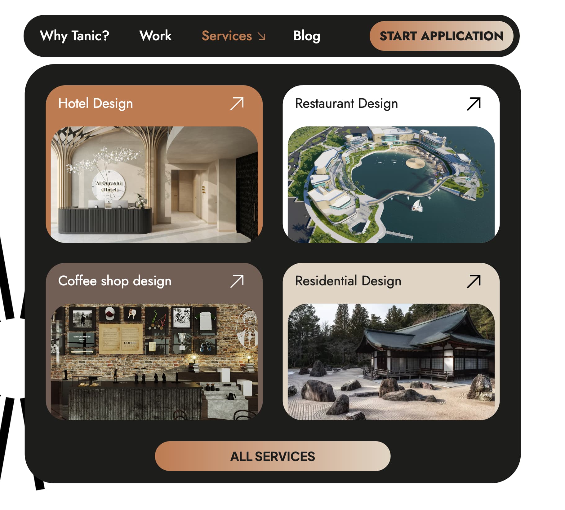
 ! Circling back on this question.
 Appreciate your help!