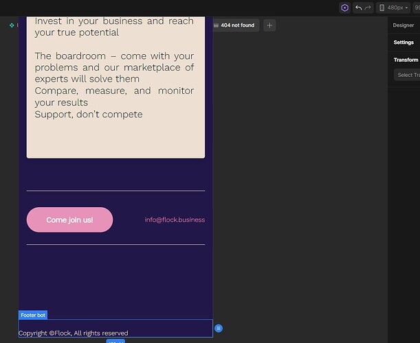
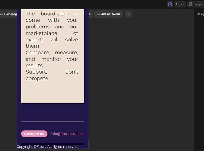
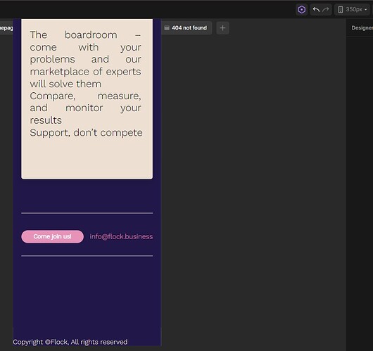
Hi, for some reason I’ve used the 480px breakpoint, and my own 350px and 320px breakpoint displays and for some reason, the website layout on divhunt and the reality are not reflected well. I’m not sure what the problem is but it’s annoying that I have to refresh my own phone to see that the divhunt coding is reflected. Is there any way to fix this? Need it for a client. Thank you!
Hey, something is not responsive on your website, so that why you have that empty white space on right, can you give me your website url so I check?
Hi Pakic, here’s the link flock.business!
I also still have website issues such as no indent for bullet points, and now the ones I’m making temporarily have the text disappear when viewing on the website. Thank you!


