Hi,
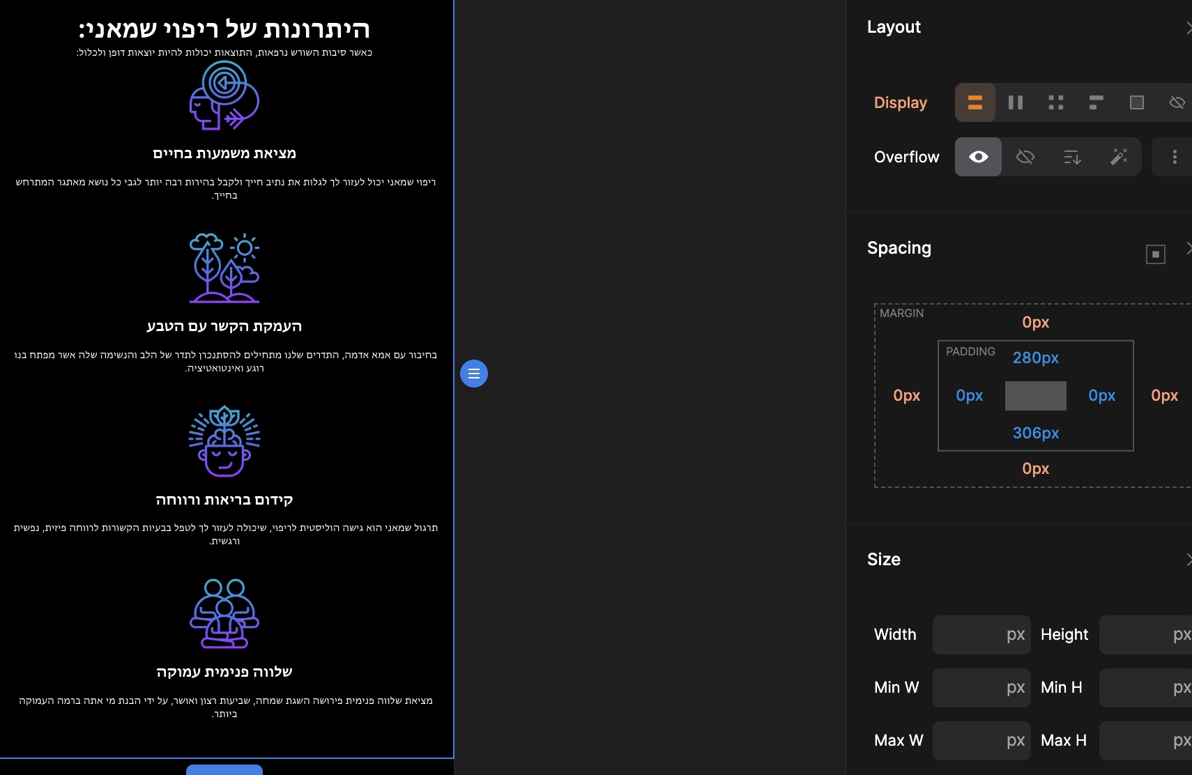
When I change to responsive breakpoints, the elements are on each other because the height is longer in a row.
Is there a way to fix it from the desktop breakpoint or do I have to fix it manually all the breakpoints?
Is it correct to give them 300px padding or better to rearrange sections with the positions?
PLEASE make a tutorial on working with responsive modes.
I have a lot of positioning fixes in the responsive breakpoints and I’m not sure it’s supposed to be like that.
Hi @Pakic Pakic
Thanks a lot for this tutorial.
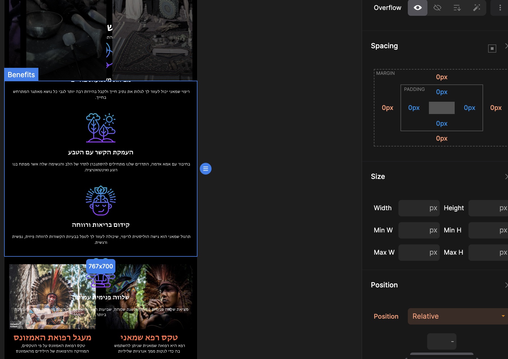
I think that there is a bug because the responsive works fine beside the 767px breakpoint.
The section is going over to the other sections and it only happens with a 767px breakpoint.
Was it better to build this section with a grid instead of a flex?
Here is a video that shows the problem:
http://dashboard.konvey.app/share/ec11867b-1835-4311-a21d-099fd0348a69
Thanks for the video again!
The problem is still there
I can only fix it when I add 2 columns in the grid on 767px breakpoint
I have found that when I set the height parameter in the desktop mode, it affects the other responsive mode and creates problems.
It all happened because I have added height px on the container.
I guess I need to use less height sizing and use more padding and margins.
I will wait for your tutorial on padding & margins.