I have created a hamburger menu with around 30 items. The menu is too long and I would like to split the menu into around 4 or 4 columns. I cannot find a tutorial to resolve this issue so if anyone could help it will be super appreciated.
Would someone be able to respond, or point me to an appropriate tutorial? It would be appreciated.
Hey @Jayz
It would be much more helpful if you attach some screenshots and share the page link so we and other people can see and suggest solutions. Otherwise it’s hard for anyone to assume anything.
That would help! I have attached a screenshot which illustrates the issue. The list basically scrolls to the full length of the page. I thought you had offered suggestions before, yet I cannot find the response so perhaps I am hallucinating! Regardless, the screenshot attached or the link below highlights the issue. (I will send you a link to the site in a message. )
https://share.zight.com/E0uJq2Qb

In addition to separating the menu into columns. If you can give me suggestions on how the split columns can be added to the hamburger menu.?
Without knowing the structure, Set it up as a Grid comes to mind:
First make sure the menu is visible during editing:
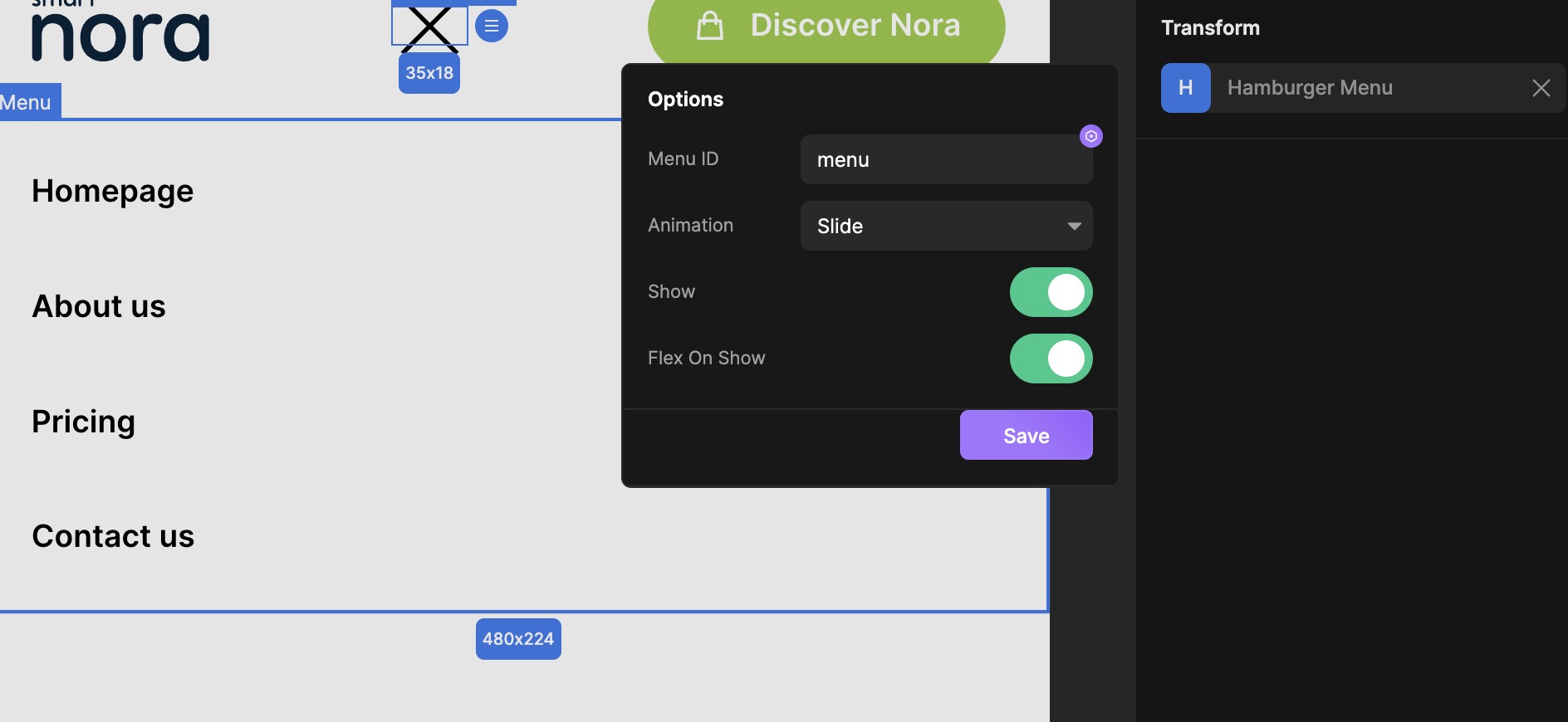
The use Grid and create as many columns that fit for your different resolutions:

But without knowing the structure, it’s hard to give more than a general answer, hope it helps 
Hi Mixxmaster,
Thanks for your input, really appreciated!
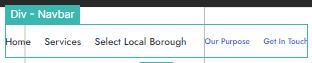
Perhaps I could have stated the issue more clear. Below is a screenshot showing the structure of the menu. This is the main site menu, and not the hamburger menu. (That will be my next challenge)
The issue is, the middle item in the main menu “Select Local Borough” … When hovering over the section (as shown in the previous screenshot) the list of items in that particular list needs to be separated into a number of columns, say 4 or 5.
I should have mentioned the Hamburger menu in my original post because it is not a Hamburger menu specific question.
No worries, GRID still applies, it doesn’t matter if you use hover or click etc.
Sorry if this gets simplified, in steps or generalized - someone else reading it later might need it 
It seems you don’t have to edit the hover in the menu link so I’ll assume you have that working. Focusing on the dropdown only:
-
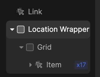
The structure of the hover/dropdown section of the menu is crucial. Use a div as wrapper and add a grid element and the links in the grid:
-
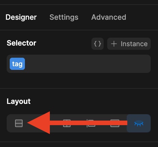
Select the wrapper and make it visible (when editing):
-
Manipulate the GRID element inside the wrapper to what you want:
-
You might have to manipulate the width of the wrapper…
-
Hide wrapper and test


PS. You can have different grid settings per breakpoint, remember that it inherits settings from largest and down…
2 Likes
Thanks for your clear explanation, this will come in really handy.
I really appreciate you taking the time to explain step by step. The steps are clear and for sure it will be helpful for someone else.