Hi guys, I’d like to ask - I finally managed to make a hamburger menu. However for some reasons, the link for the nav menu on the desktop version and on the mobile versions are different. So the nav menu is: About Us - Resources - Be a Member - Contact Us. The desktop buttons link correctly to each respective site, but the phone version (Hamburger menu) doesn’t link them right (They all link to the About Us page instead). Does anyone know the right solution for this? Thank you!!
Another issue is that even if I change the link to the website url, it automatically reverts back to menu for this particula nav tab which is frustrating, even after I save it to the new url. Is it a bug?
Hey, send me a website url and I will check that for you
Hi Pakic, here’s the link flock.business!
I also still have website issues such as no indent for bullet points, and now the ones I’m making temporarily have the text disappear when viewing on the website. Thank you!
Would love live assistance help so I can resolve every divhunt issue on the website by today.
part 1: Loom | Free Screen & Video Recording Software | Loom
part 2: Loom | Free Screen & Video Recording Software | Loom
I wasnt sure what text ident you were talking about, if you could screenshot me where to look?
In video above, I explained how to use components, which is very important for sections such as navbar, and linking of items in navbar, and as well how I fixed your logo being clickable on empty space
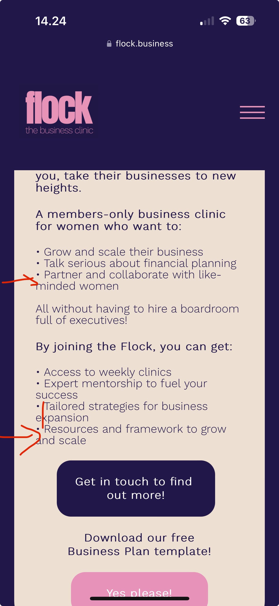
I want the text to follow the text line above it instead of the bullet point.
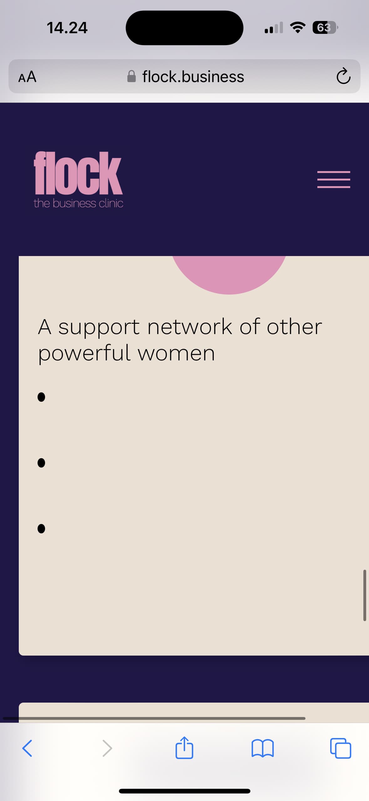
also my real live website, the text is missing even though it’s available at the break point

Is there someone I can live-chat with? There’s so many issues that I need to resolve by today.
Also thank you for teaching me about the components and logo adjustments, I’ve applied them to the footer as well.
For the website, I’ve changed the text to black but it’s still blank on the website