I have many parts in my Navbar and I would prefer to have the hamburger menu also in the desktop view.
How can I do that?
I have many parts in my Navbar and I would prefer to have the hamburger menu also in the desktop view.
How can I do that?
I will sugest you to prepare it via Modal Plugin.
1st step up the div in navbar incl. burger image
2nd apply the Modal Plugin
3rd set-up the component for Menu
4th connect component with Hamburger
Here is a small video on how to, you just need to play around with the width and positioning 
Hey @Stolichnaya, here is how can you achieve that, all you have to do is find your hamburger menu on desktop in your layers panel and set it to be flex:
After that you just need to make some changes like this:
Input any gap you want between your lines I went with 4px.
After that you need to style your lines as well, just set them dimensions and background color:
After that you need to position your menu, if you are not sure how positioning work you can check out our youtube video about positions:
After that just hide your menu and you are all done.
I hope that this answers your question, if you again have any problems with this feel free to ask here !
Or use the Darko’s option
@petrbilek, thanks for providing solution for this question !
Thanks guys for helping so much
It is wonderful to see different solutions for configuring things on the builder
@petrbilek This solution is too long for me
@Darko I Have configured it it works great!
I think that I’m a bit in LOVE with this website builder.
Keep on the good work 
Hi,
I tasted the solution on a different page and on my current project, I have some problems.
my website:
Seems to be also issue of positioning. I would suggest you to check some CSS basics which might helps you build with the tool.
We have this tutorial to understand positioning better:
 | Divhunt Basics")
Hi @Darko
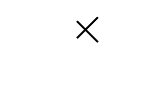
In your solution there is a problem with the X sign when the menu is open.
It doesn’t show the X sign, only the 3 lines.
I have tested it on new Navbars and it is the same.
How can I have the close button on the hamburger desktop menu?
@Pakic
Can you help me fix the X sign when opening the hamburger menu on the desktop view?
http://dashboard.konvey.app/share/05210e1f-b9f5-4af1-a3e6-addc7843573a
Hey @Stolichnaya, here is what you need to do, you just need to paste this code:
div {
top:0;
position:relative;
transition:0.2s;
}
.dh-active > div:last-child {
top:-8px;
position:relative;
transform:rotate(-45deg);
}
.dh-active > div:first-child {
top:8px;
position:relative;
transform:rotate(45deg);
}
.dh-active > div:nth-child(2) {
opacity:0%;
}
Into custom code of your hamburger on a desktop breakpoint:
It should look like this:
Thanks a lot!
The icon - X doesn’t look right.
How to make the left side the same?
Tested on 2 websites
Best Regards
To achieve this you would need to change position values for :first-child and :last-child. If you are not sure how to do this you can just send me a link to your website and I will fix it for you
I can do it but I don’t want to experiment in CSS mode
Can you give me the parameters to update in the code?
by the way, it is super cool and esthetic in desktop view.
Love it
I can give you the parameters but you would need to provide me with a link to your website so I can test it out first
I have tested it on different websites.
This is the same for all websites.
Do you mean that the code parameters will be different on each website?
Divhunt has predefined parameters that work perfectly for hamburger (they make perfect X) but when you manually change sizing options of a hamburger menu those parameters need to be changed manually as well. If you don’t want to change predefined settings for X animation you just need to set the width of your hamburger lines to 35px and that should fix the problem if you didn’t change any other sizing options here.
Try out this method and let me know if it still wont align properly.
Hi,
It didn’t work.
lines are wider but the X has the same problem.


