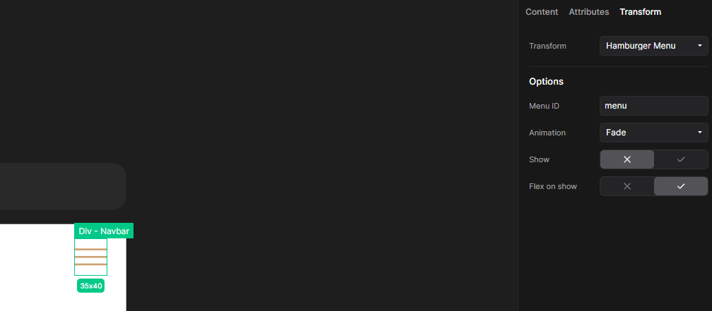
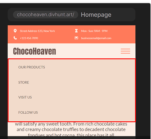
I created the whole structure for this as you can see in the image below:
How can I make the functionality of a Hamburger button, do I need JavaScript or it can be done without it?
I created the whole structure for this as you can see in the image below:
How can I make the functionality of a Hamburger button, do I need JavaScript or it can be done without it?
Thats a great start! Now rest is peace of cake 
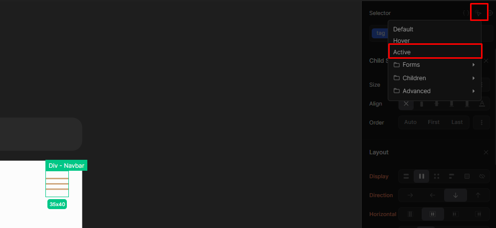
I rounded it in red in screenshow below. Lets say you put ID of menu.
Just like in my screenshot.
Menu ID - ID of the menu, in first step we named it menu.
Animation - Animation of menu toggling when you are clicking hamburger button.
Show - Use this to temporary show your menu so you can edit in inside builder.
Flex on show - Sometimes when menu is opened, you need it to be in display:flex
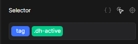
When button is clicked and menu is opened, your button will get a class dh-active. Now you can edit this button in active state inside builder.
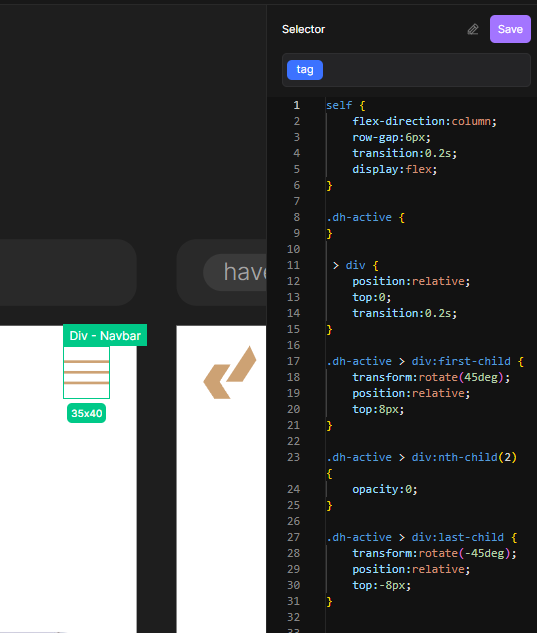
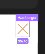
Now you can use that state to create whatever you want, even some advanced animations with custom CSS (screenshot below)
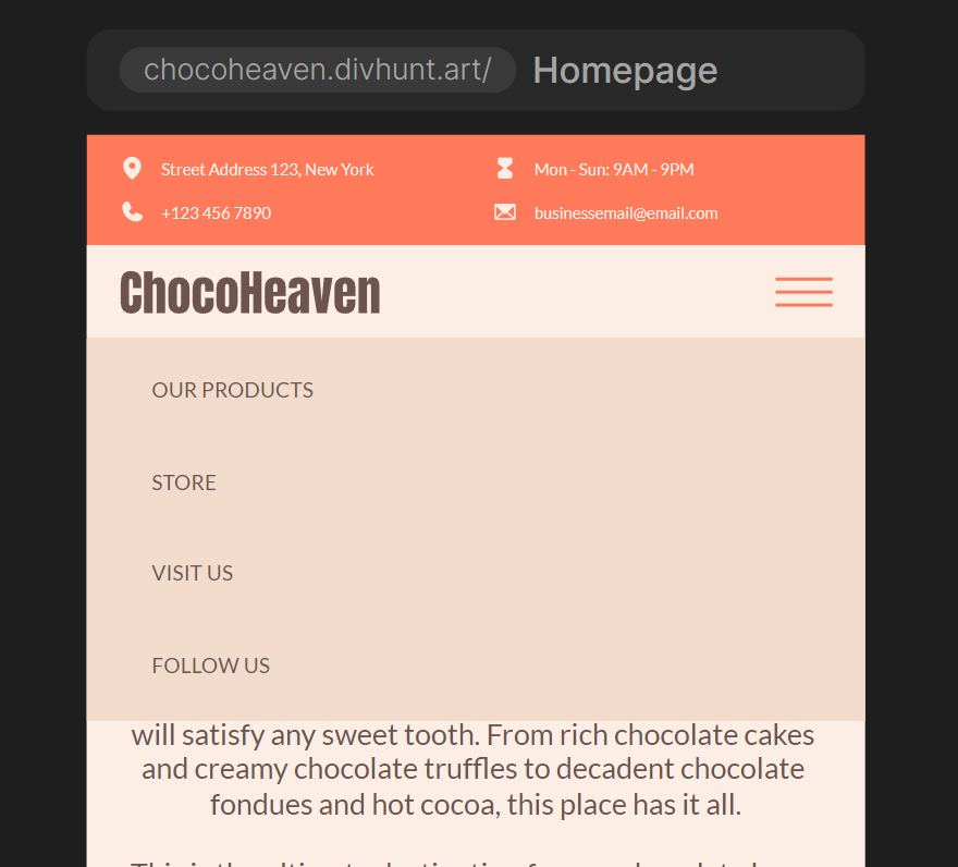
If you use CSS from screenshot above, your hamburger will look like on screenshot below when menu is opened.
I will leave this CSS code here if you want to use it on your project:
self {
	flex-direction:column;
	row-gap:6px;
	transition:0.2s;
	display:flex;
}
self > div {
	position:relative;
	top:0;
	transition:0.2s;
}
.dh-active > div:first-child {
	transform:rotate(45deg);
	position:relative;
	top:8px;
}
.dh-active > div:nth-child(2) {
	opacity:0;
}
.dh-active > div:last-child {
	transform:rotate(-45deg);
	position:relative;
	top:-8px;
}
Is the menu an image or style?
Would I need to create a separate menu for mobile, or can I reuse Desktop navigation?
In most cases you can re-style your navigation that you used on desktop to fit on mobile, to be like a popup?
I will create a tutorial on how to create a proper navigation soon