Hi,
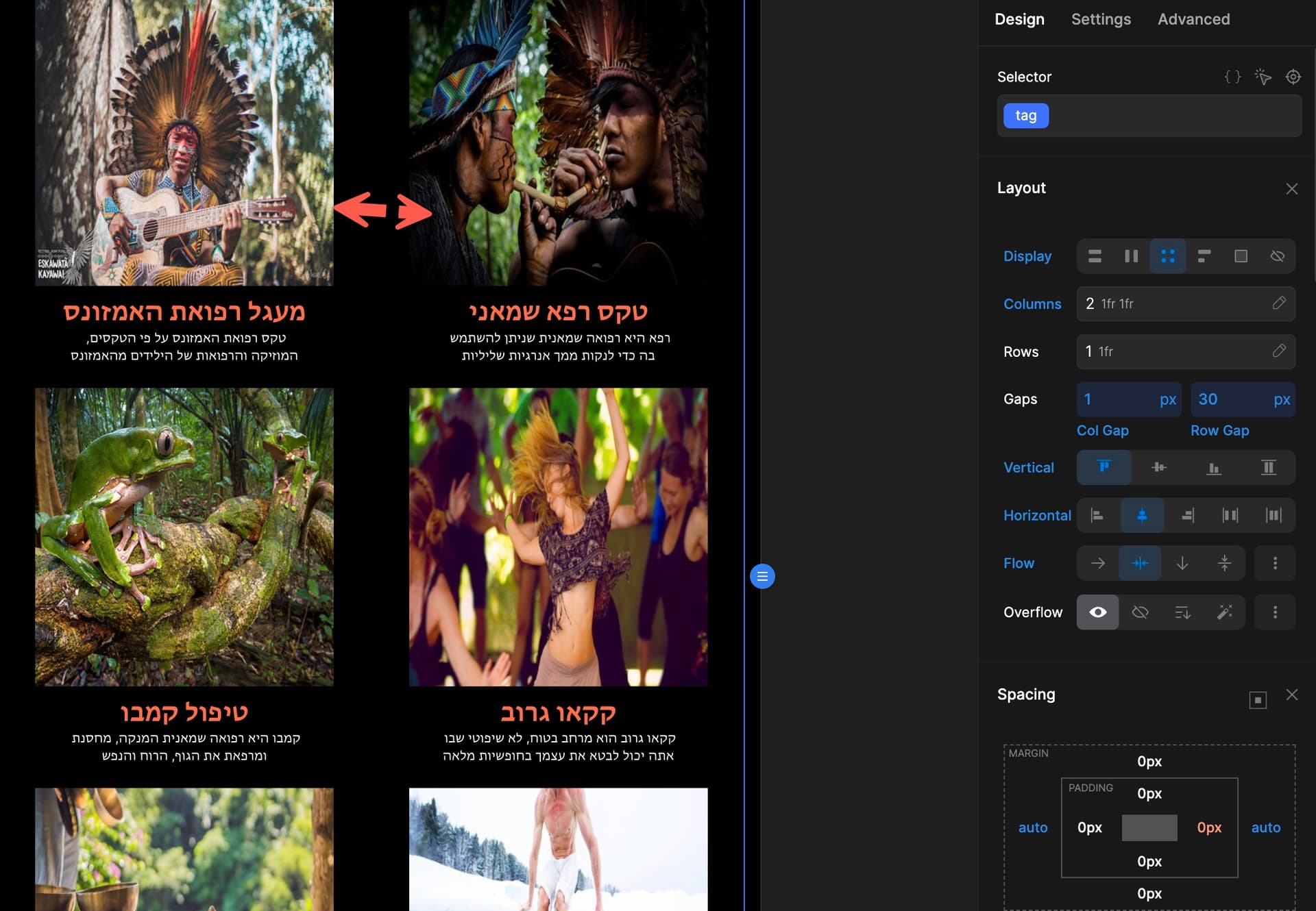
I have configured a section grid with 6.
2 rows of 3.
The section is not responsive.
How can I force it to be responsive automatically without the need to adjust all the other responsive views such as tablet and smartphone?
I need on the tablet that instead of 3, it will show 2, and on the smartphone, only 1 instead of 3.
The photo is from 480px view
1 Like
Darko
2
When you are using a grid you need to go from breakpoint to breakpoint and manually change styles.
1 Like
Breakpoint means the different responsive views?
So I need to reduce the grid columns in the other breakpoints to tablet: 2, smartphone:1 right?
1 Like
Darko
4
Yes, breakpoints are different responsive views, and again yes, you just need to switch between those breakpoints and reduce columns in your grid.
1 Like
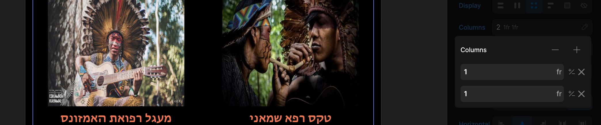
Brother, I just need a small help to understand this
In breakpoint 991px, I have changed the grid columns to 2.
The thing is that there is a big space between the 2 grids and the column gap option doesn’t really reduce the space.
Why the column gap doesn’t work and how can I reduce the space or make the photos bigger?
Thanks a lot!!!
Pakic
6
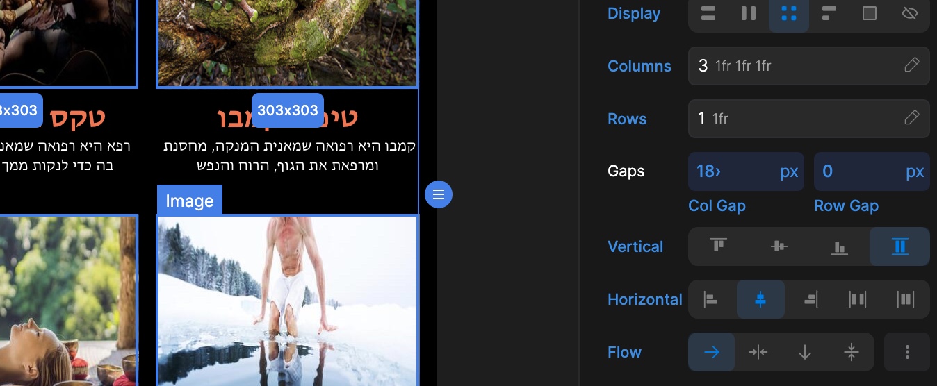
Is there any max-width applied to cards, or does image has 100% width set?
Yes, they have.
it was 100% max-width on images
I have checked the column gap and this problem is only in breakingpoint 991px
I have removed the max width and it’s not working either.
In other breakpoints even when I add 100 max-width to the images, cards, cards wrap it is still works fine.
If I change the grid column to 3, the col gap is working fine.
This problem only happens when I set grid column of 2
Why do you ask about max-width 100%?
Didn’t see a problem with 100% max-width set to in other responsive parts
I have configured this element on 2 pages and I get the same results.
Probably issues with configurations.
Here are the pages when you have time to check:
https://healing-space.divhunt.art/
https://healing-space.divhunt.art/backup