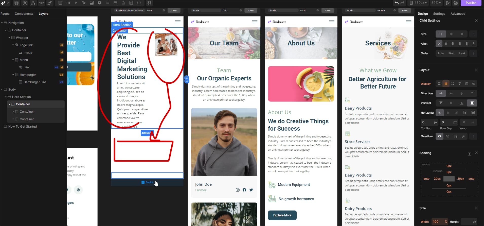
How to make Divs and sections as responsive in mobile view? Is there any tutorial on using the Layout especially flex, grid, and Position like sticky, relative for Non-coder?
When I change the viewport to mobile then I get the following style. I want to make mobile version responsive but don’t know how to use the flex and all layout options.
1 Like
Hey @Tariq, we currently don’t have tutorials for those options. You can find tutorials for that on youtube or on google.
Hey @Tariq
As Darko mentioned, you can take a quick look on youtube how Flex works, and then apply that on Divhunt.
But beside that, you can change Display from Flex to Block, that will make container items vertical aligned.