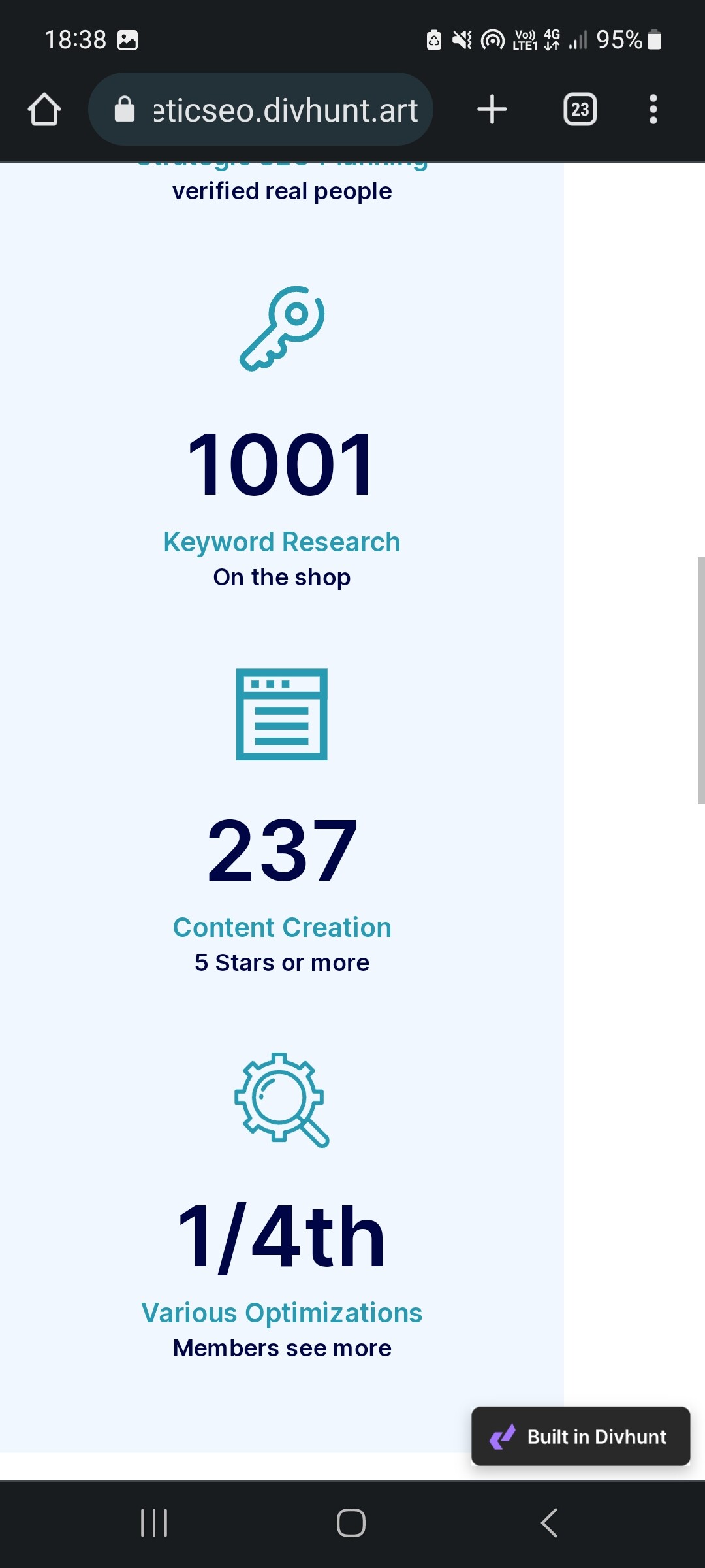

How to fix this? When I zoom out on my phone it looks like this. Can I make it to the actual size of my phone and be responsive? Thanks
1 Like
Hey @chrischopodliq, by the look of these screenshots id say the problem here is the image, I believe that you put a fixed size to those images. But to be 100% sure you can send me a link to your website so I can check.
1 Like
hey sorry for the late reply. cyberneticseo.divhunt.art please take a look when you can
1 Like
I found what’s causing the problem in your project, as I suspected there is fixed sizing to your image, also you have a negative margin that is pulling your image to the left:
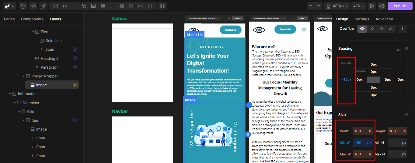
How can you fix this, you just need to remove this margin and avoid putting fixed width to your elements (fixed width is everything that is not automatically scalable (pixels)). The best way to put size to your elements is to set max-width in pixels and put width to ‘100%’, this way your element will adapt to smaller devices and automatically resize.
1 Like