Hey! What’s the process for creating masks? I tried -webkit-mask-image etc. in the CSS, but it made the image disappear entirely.
Hi,
So in written:
- You need to have a div which is a wrapper of an image, relative position
- In that same wrapper we add one more div (mask/overlay)
- overlay should be position absolute, width & height 100%
- and now you set transparent background to mask in whatever color/style you like
What’s the best way for me to translate that into using an image as a mask for another image (example below):

I tried tossing -webkit-mask-image:url([insert url here]) into the CSS a few times, both with an SVG and a PNG, but they both resulted in the image disappearing. When I tried the code on an HTML viewer, it worked as intended.
Thanks so much for all of your help. You guys are seriously fantastic.
Hi,
for that effect you can use this example. Just here instead of gradient, you would add your background image.
I think I’m not quite expressing myself well here (I appreciate your patience). What I’m looking to do is extend that to images (i.e. instead of clipping to the text, it clips to the non-transparent areas of the image).
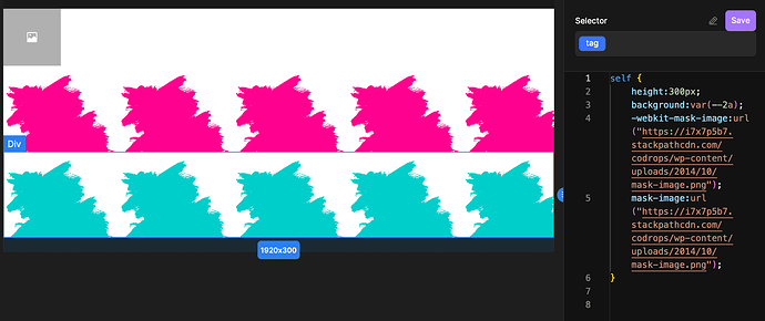
I tried with a different PNG today, and it seems like the issue may be something getting lost in the hosting(?). Here is (in principle) what I’m trying to achieve:
Here is a link to the PNG that’s being used successfully as a mask in that screenshot.
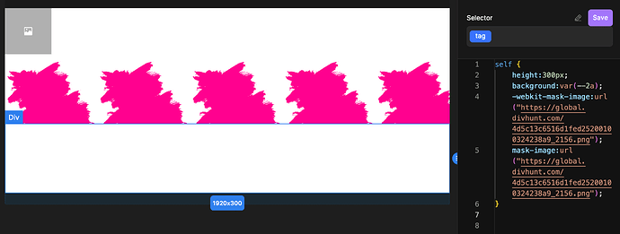
If I take the same PNG link that I’m using for the mask and import it into Divhunt (via the images uploader), and then try to switch out the mask link for the same image hosted on Divhunt, the div disappears:
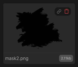
In the images section, it seems like the alpha channel is coming through correctly (i.e. it’s not like it’s translating into a white background instead of transparent):

Any ideas?

