📢 This forum is no longer actively updated, but we've kept it online as a resource — there's a lot of helpful history here! For new discussions, come join us on
discord!
I’ve been following this tutorial up until this exact minute, and everything was going well: Tutorial Link
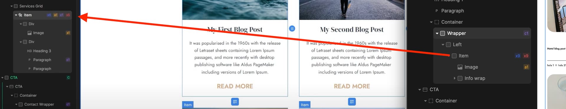
However, I’ve noticed that when linking the items on the blog page to the single blog page, yours uses a link item, while mine is a Div element. How can I convert my Div to a link?
But I would agree that in this case, converting link that inside to span or paragraph makes more sense, since idea is to wherever you click, to go the same place.
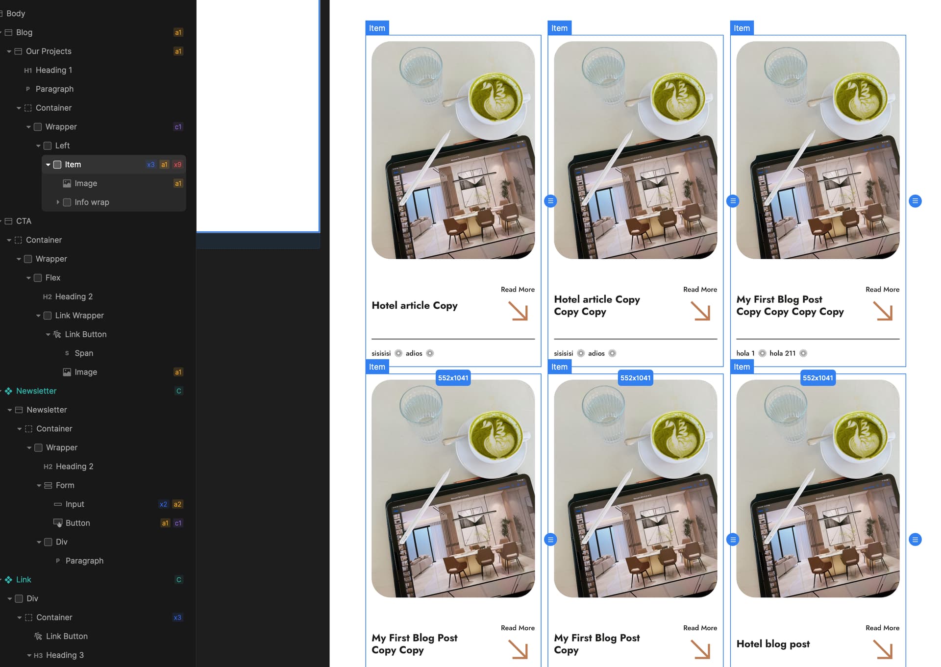
Good news, the link issue got sorted out. But now, I’m facing a new problem – this section seems to be getting cut off. I’ve added padding, but it’s still not working. Any suggestions?
Hey @Yaiza, at first look I’d say that you have some fixed width to some tags, but to give you a precise answer I’d need to take a look at your project, so if you can provide me with a link it would be nice.
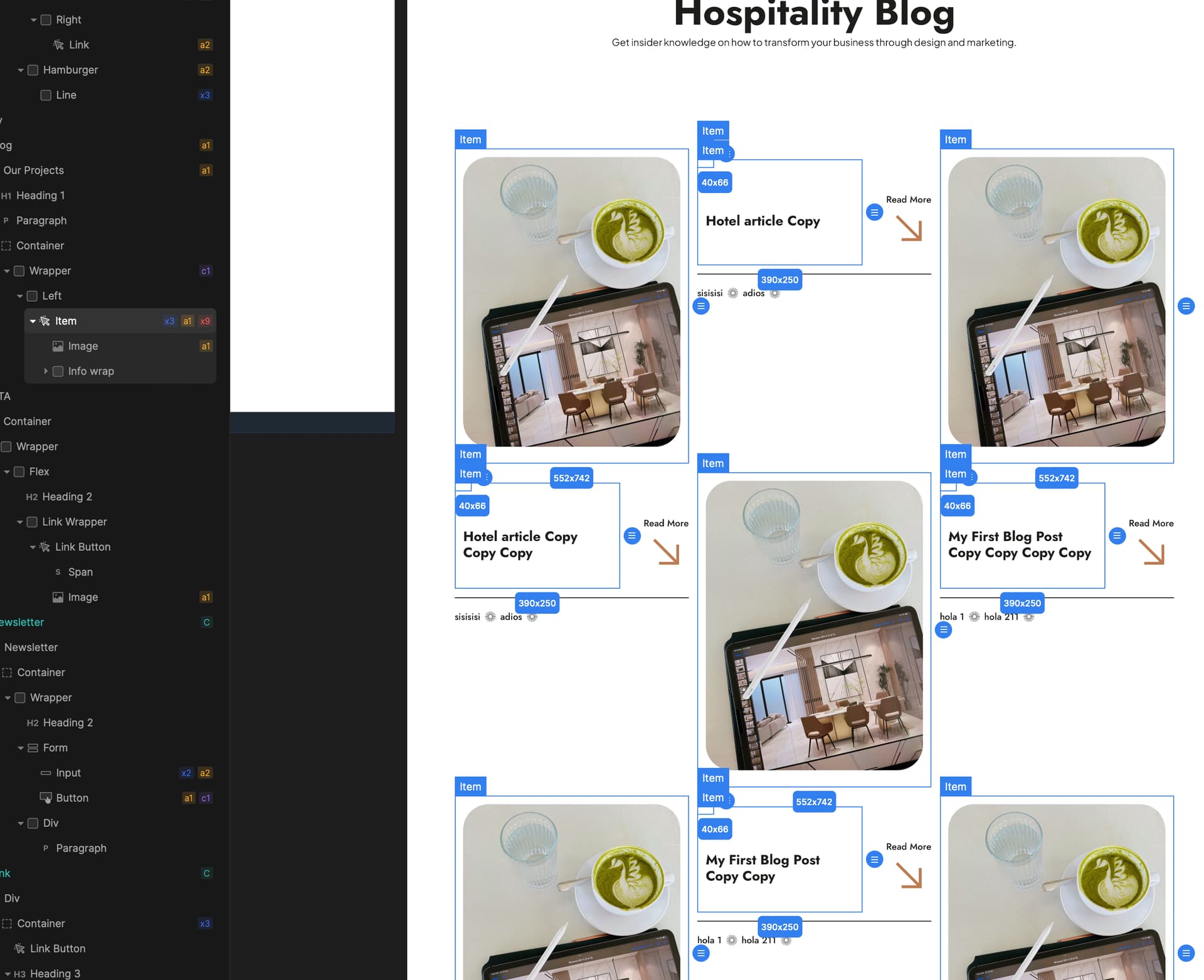
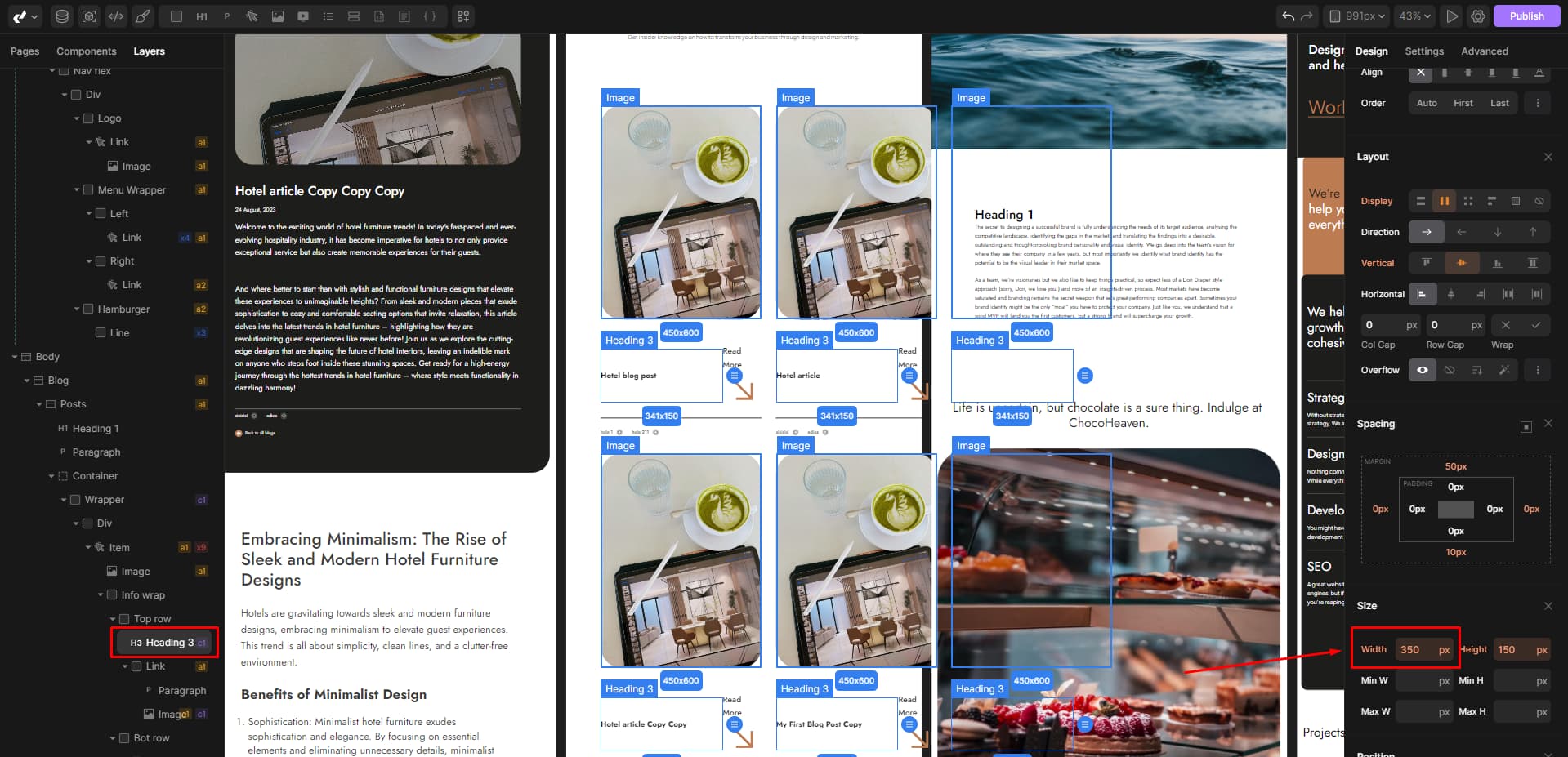
You have a fixed width on your H3 tag that is pushing everything to the right and making additional space. You just need to remove it and it will work properly.
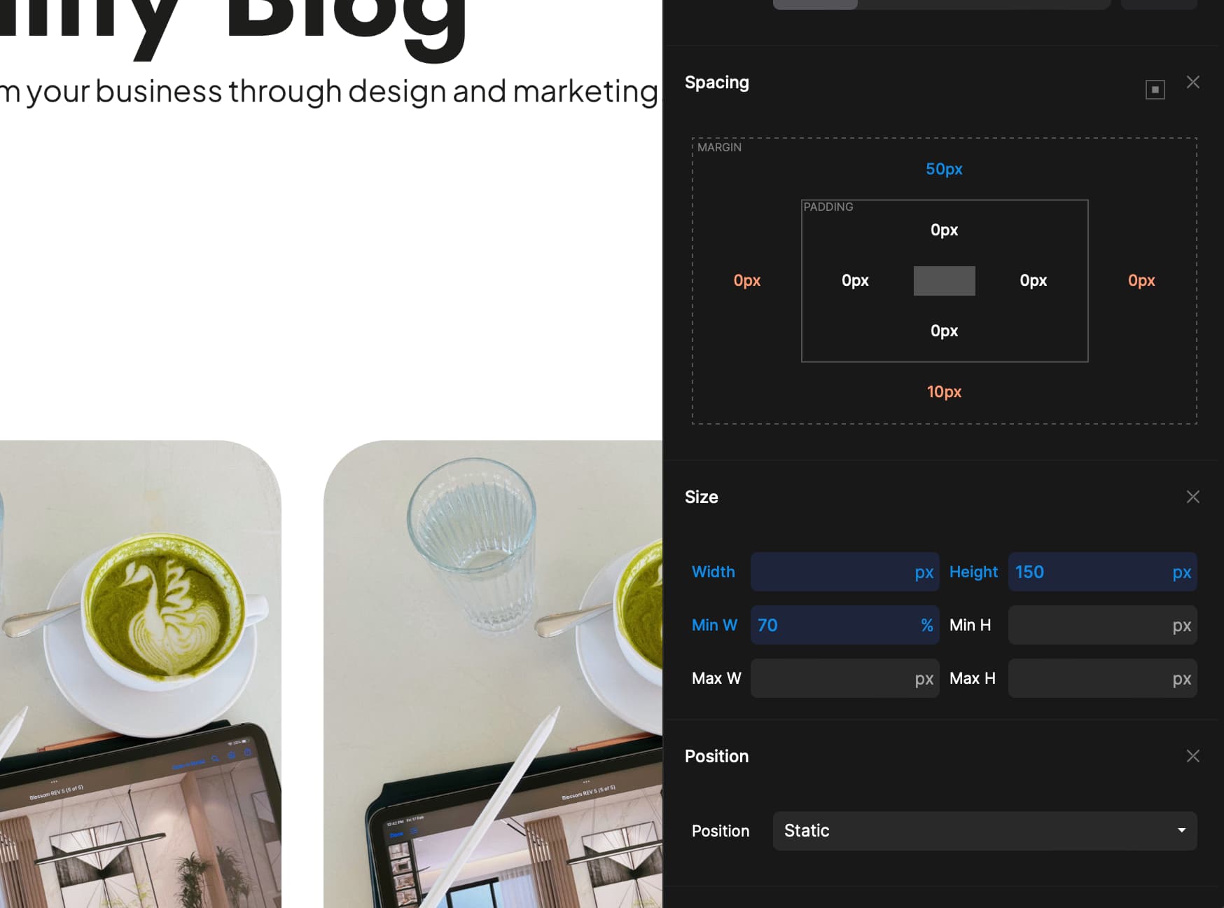
I swapped that one out and put in a 70% width, so the text takes up most of the space. But it’s still getting cut when the window size is reduced. Any way to make it responsive and not get cut?
It’s not wise to set a fixed width and minimum width in this case, you can set your width in percent which will help resize your tag. When you set width or min-width in pixels that tag will push everything and it will make a mess in your project, but if you want to set precise width, you can do so and set some custom breakpoints and then fix it on smaller devices.
Thanks for your advice, @darco! I appreciate your input on setting widths in percentages for responsiveness. So, is ok to only set the H3 to 70% min?
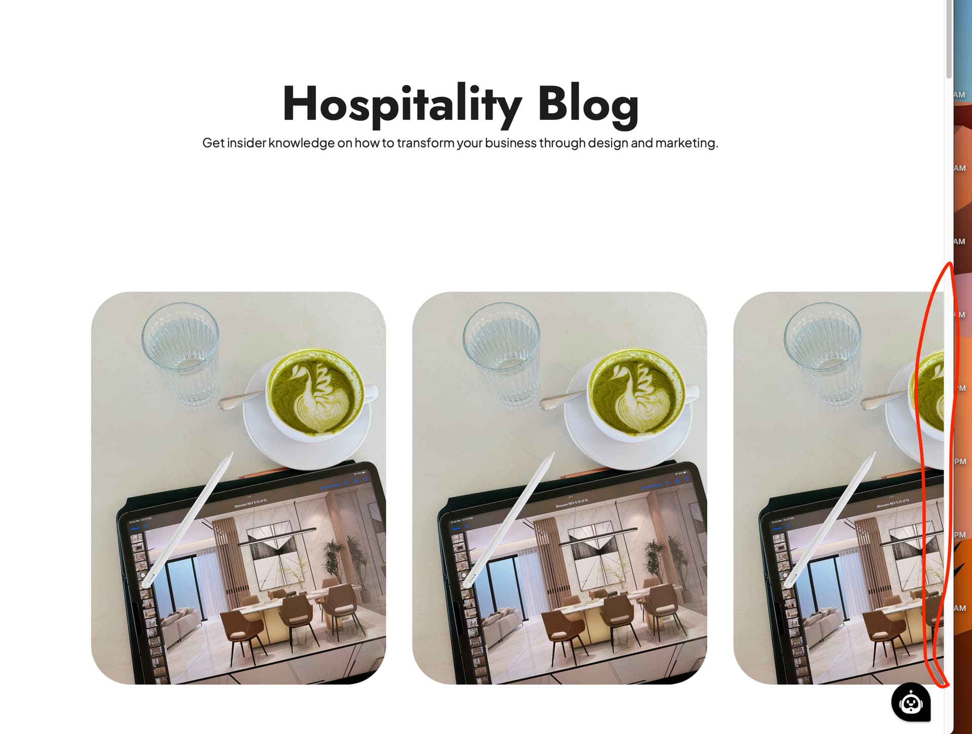
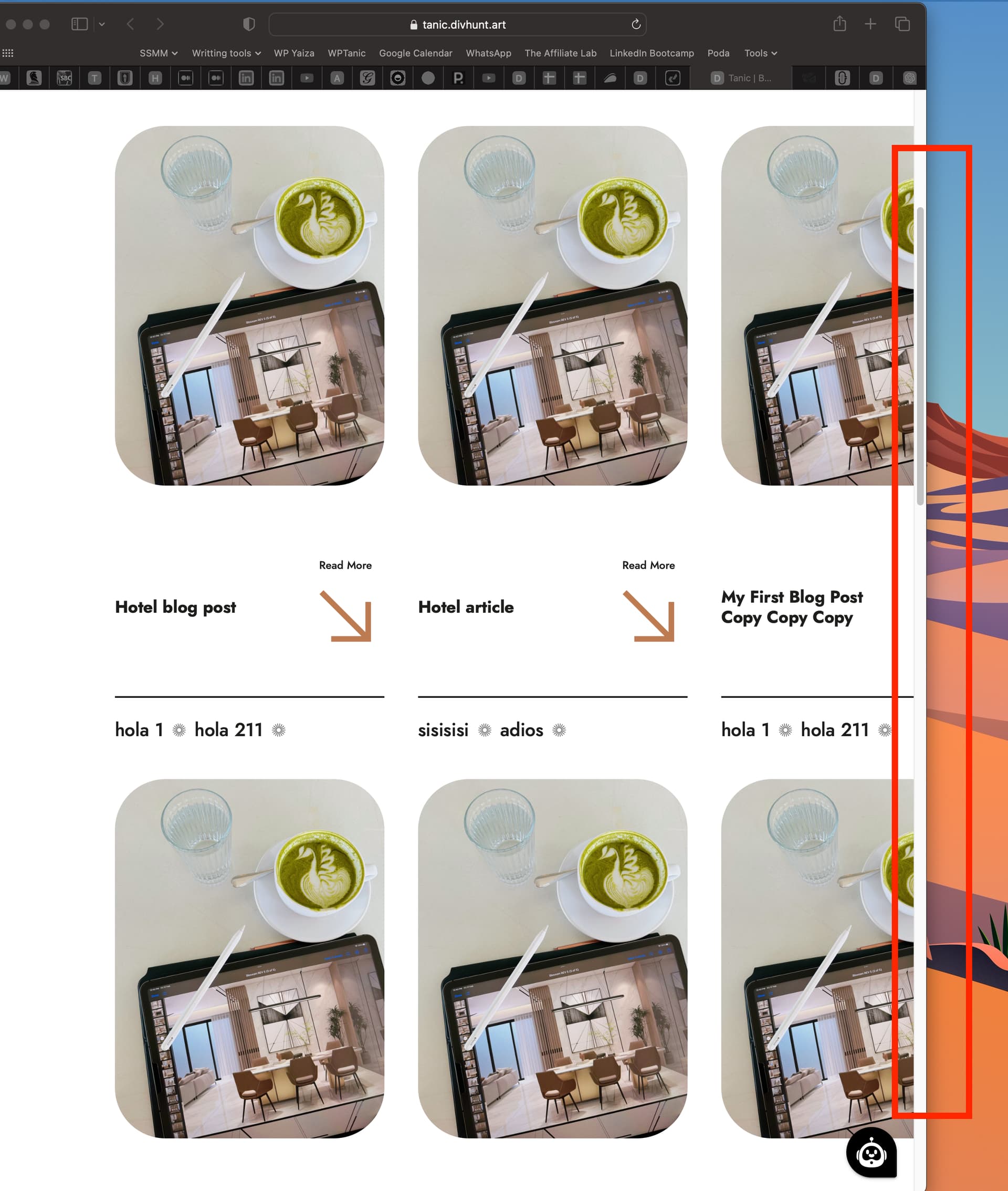
I gone ahead and add the the breakpoints as suggested, but still I can see it appear cut: New Recording - 28/08/2023, 15:22:52 Your insights would be really helpful. Thanks again!
Can you give me your website and explain me a bit better what you are trying to do?
You want title to take 70% of space on the left size, and button read more to take 30% on the right?
Better alternative for this is, if button is always the same, you might want to set it to fixed width like 100px, and set flex: 1 on your h3, so it can take rest of the space.
If this is something you are trying to achieve, give me link of your website and I will create a video tutorial on how to do it.
I’d like the title to occupy around 70% of the space on the left, while the “Read More” button and arrow on the right shouldn’t take up more than 30% of the space. The main concern is to make it responsive so the whole grid doesn’t appear cut. At the moment I set the customisation for different break point, but still I can see it gets cut at some point.
Here’s the link to my website: Tanic | Blog. I appreciate your offer to create a video tutorial – that would be really helpful!