Hello Divhunt team,
I’ve been trying to implement an animated background effect in my hero section similar to what Calendly uses on their website (https://calendly.com/), but I’ve encountered multiple roadblocks despite trying several different approaches.
What I’m trying to achieve:
- A subtle, animated background with moving blue and purple gradient shapes/blobs in the hero section
- Similar to the flowing background effect seen on Calendly’s homepage
- The effect should appear behind the hero content without interfering with it
What I’ve tried so far (all unsuccessful):
- Embed Component Method
First, I tried adding an embed component to the hero section with this code:
<style>
  .animated-bg {
    position: absolute;
    top: 0;
    left: 0;
    width: 100%;
    height: 100%;
    background: linear-gradient(-45deg, #6a5acd, #00bfff, #ff69b4, #00fa9a);
    background-size: 400% 400%;
    animation: gradientMove 15s ease infinite;
    z-index: -1;
  }

  @keyframes gradientMove {
    0% { background-position: 0% 50%; }
    50% { background-position: 100% 50%; }
    100% { background-position: 0% 50%; }
  }
</style>

<div class="animated-bg"></div>
Result: The code appeared in the embed component but had no effect on the site.
- Custom Code Section Method
Next, I tried adding code to Site Settings > Custom Code in both Head End and Body Start sections:
In Head End:
<style>
@keyframes gradientBG {
  0% { background-position: 0% 50%; }
  50% { background-position: 100% 50%; }
  100% { background-position: 0% 50%; }
}

.animated-bg {
  position: absolute;
  top: 0;
  left: 0;
  width: 100%;
  height: 100%;
  z-index: -1;
  background: linear-gradient(-45deg, rgba(0, 119, 255, 0.7), rgba(143, 0, 255, 0.7), rgba(0, 194, 255, 0.7));
  background-size: 400% 400%;
  animation: gradientBG 15s ease infinite;
}
</style>
In Body Start:
<script>
window.addEventListener('load', function() {
  const heroSection = document.querySelector('section');

  if (heroSection) {
    heroSection.classList.add('hero-section');

    const animatedBg = document.createElement('div');
    animatedBg.className = 'animated-bg';

    heroSection.insertBefore(animatedBg, heroSection.firstChild);
  }
});
</script>
Result: Nothing appeared in the hero section.
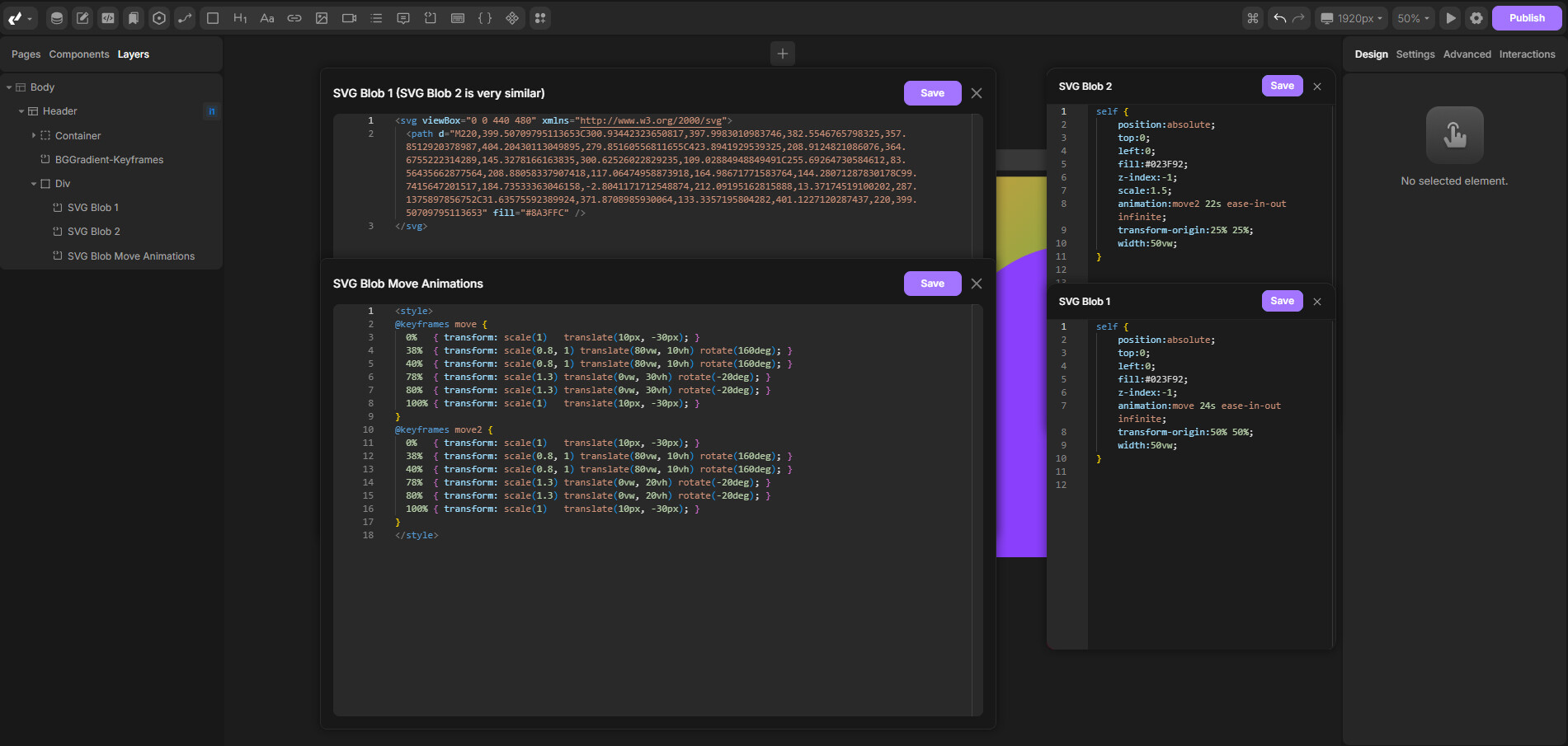
- Animated Blobs Method
I then tried creating animated, blurred shapes to mimic Calendly’s effect:
<style>
.blob-blue {
  position: absolute;
  top: -10%;
  right: -10%;
  width: 60%;
  height: 60%;
  background-color: #0077ff;
  border-radius: 50%;
  filter: blur(70px);
  opacity: 0.7;
  animation: moveBlob1 30s ease-in-out infinite;
  z-index: -1;
}

.blob-purple {
  position: absolute;
  bottom: -20%;
  left: -10%;
  width: 70%;
  height: 70%;
  background-color: #8f00ff;
  border-radius: 50%;
  filter: blur(90px);
  opacity: 0.6;
  animation: moveBlob2 35s ease-in-out infinite;
  z-index: -1;
}

@keyframes moveBlob1 {
  0% { transform: translate(0, 0); }
  50% { transform: translate(50px, -30px); }
  100% { transform: translate(0, 0); }
}

@keyframes moveBlob2 {
  0% { transform: translate(0, 0); }
  50% { transform: translate(-50px, 50px); }
  100% { transform: translate(0, 0); }
}
</style>
Result: Again, nothing showed up.
- Simple Test Case
To troubleshoot, I tried a very simple test case:
<style>
#animation-test {
  position: fixed;
  top: 10px;
  left: 10px;
  width: 30px;
  height: 30px;
  border: 2px solid black;
  z-index: 9999;
  animation: testAnimation 3s infinite;
}

@keyframes testAnimation {
  0% { background-color: red; }
  50% { background-color: blue; }
  100% { background-color: red; }
}
</style>
With JavaScript:
<script>
document.addEventListener('DOMContentLoaded', function() {
  var test = document.createElement('div');
  test.id = 'animation-test';
  document.body.appendChild(test);
});
</script>
Result: Interestingly, the test square DOES appear and animate correctly, showing that basic animations can work.
- Simple Blob Test
I then tried a single, simple blob alongside the test square:
.simple-blob {
  position: fixed;
  top: 50px;
  left: 50px;
  width: 200px;
  height: 200px;
  background-color: #0077ff;
  border-radius: 50%;
  filter: blur(30px);
  opacity: 0.7;
  z-index: 9998;
}
Result: The blob briefly appeared but was static (no animation) and then disappeared when implementing more complex solutions.
Important note:
I was able to implement this exact same effect in just a few minutes using a standard IDE and web development tools. The CSS/JS code itself works perfectly in regular environments, so the issue seems to be specifically with how Divhunt processes or restricts custom code and animations.
Questions for the Divhunt team:
- Is there a recommended way to create animated background effects in Divhunt?
- Are there specific limitations on CSS animations or JavaScript DOM manipulation I should be aware of?
- Is there a native Divhunt component or feature I could use to achieve this effect?
- Could there be a specific setting in my project that’s preventing these animations from working?
Any guidance would be greatly appreciated as this effect is quite important for my project’s aesthetics.
Thank you!