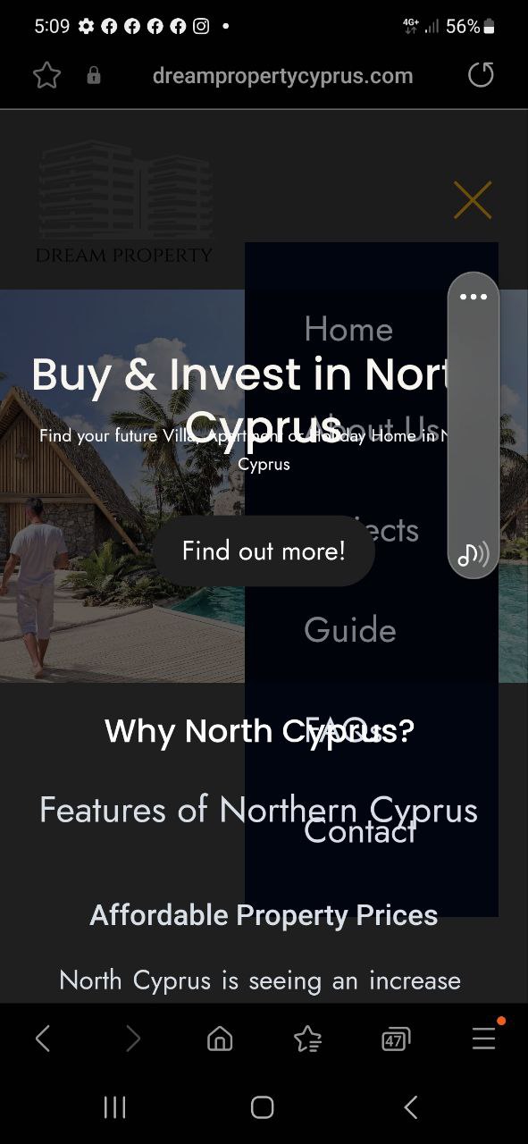
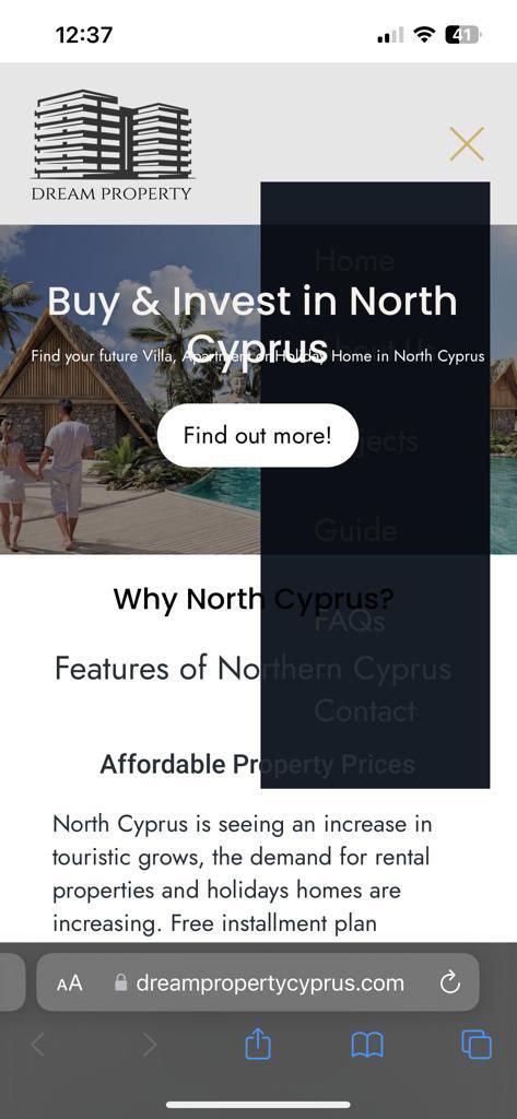
Frameworks and colors on the mobile version for android and IOS look completely different and not at pair. The (android version is showing something completely different from the IOS.
I am looking for the possibility to be more in pair with the web version but everything on mobile version is clunky and out of place.
Second Issue with the mobile version is that the dashboard hamburger header does not updates and it looks horrible check the images below both IOS and Android
I have also experienced that mobile layouting is not quite straightforward. This is partly because the canvas is fixed in size and cannot be adjusted arbitrarily, which would simplify testing.
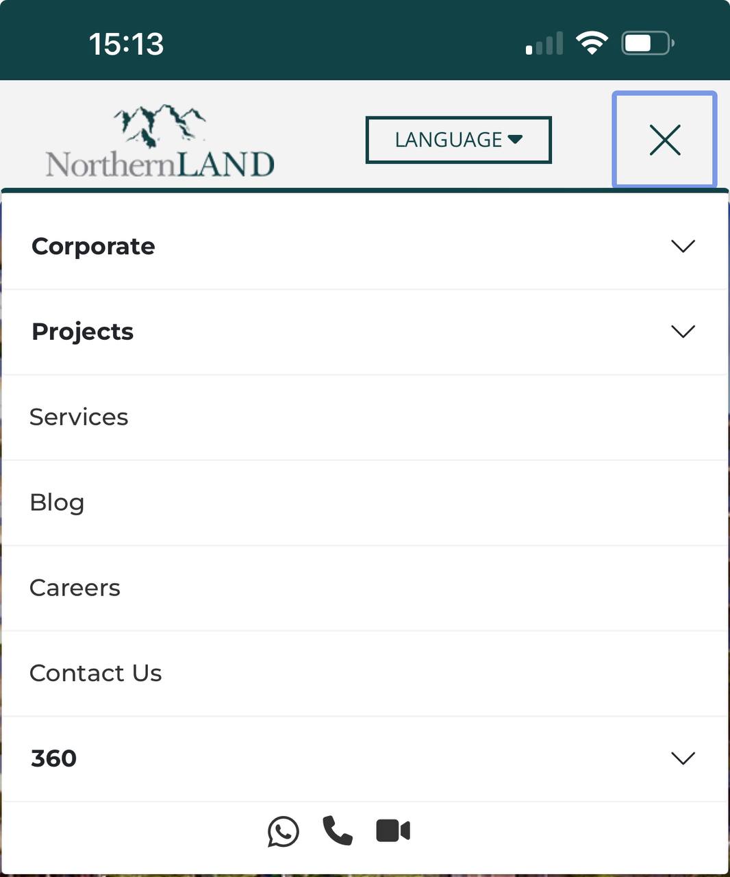
I briefly looked at your site. Regarding the overlapping, I would recommend checking the Z-index values more closely. And for the mobile menu: It’s best to activate the menu on the canvas and then style it.
I’ve adjusted some colors of hamburger menu to fit your website. And issues were in Z-index of your sections. Your other sections had z-index 1000, while your navbar had less than 1000. That was causing bugs.

