Hi everyone,
I’m trying to create a horizontal scrolling portfolio website based on this DivHunt tutorial: https://www.youtube.com/watch?v=escpTDMqWcQ
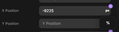
My current problem is that the website’s width changes on different screen sizes, so I can’t use a fixed pixel value for the width.
Does DivHunt have a way to:
- Get the current total width of the website in the browser?
- Set this width as a variable in the GSAP plugin?
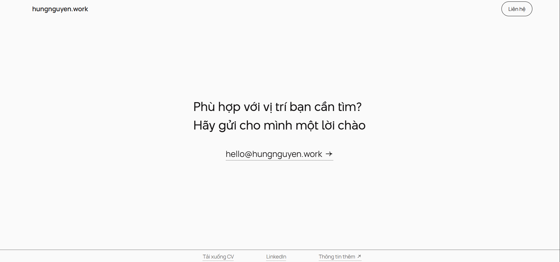
This is what I want, this section should stays in the middle
but since the value is fixed, this section does not stay in the middle anymore
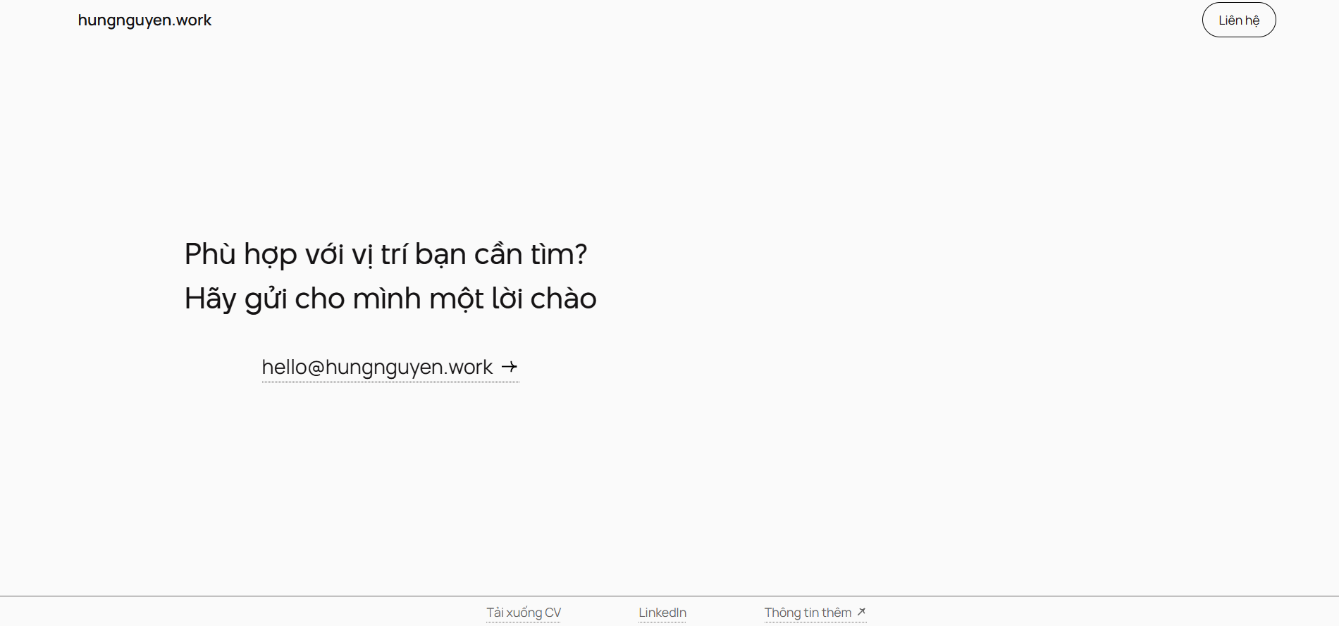
Here’s my website for futher helps: hungnguyen.work
I want to do this so the horizontal scroll works correctly on all screen sizes (mostly desktop) .
Thanks!