Hi team,
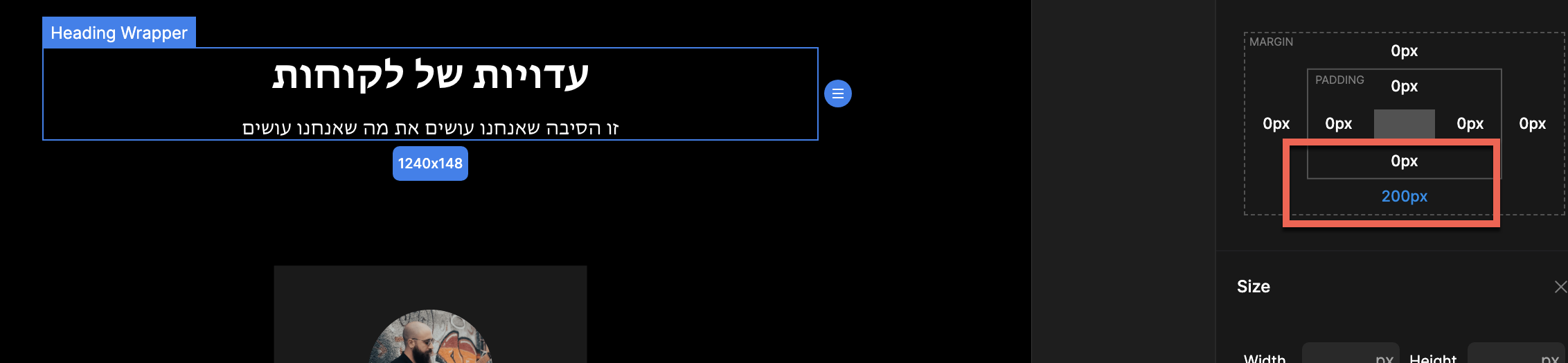
I have a section with heading and cards for a swiper.
Is it okay to make such a big space between the cards and the heading as 200px with the margin tool?
Is there a better way to make space between them?
Is there a safe use or maximum px recommendation of margins and padding when space is needed?
Is it better to use the margins of the top and bottom (Cards and heading equally instead of using only the heading wrapper for it?
For example, heading wrapper = 100px margin
Cards wrapper 100px margin
Is the positioning such as relative or absolute better to make a space that big?