Hi!
My website was working properly in any mobile device but since a couple of days ago it completely messed up in iphones. It needs to be open in the actual device, if you just use desktop chrome to show the mobile version it will show correct.
You can see a screen recording from an iphone here: WhatsApp Video 2024-12-29 at 00.10.28 · CleanShot Cloud
Any help here, please? I’m a bit lost and don’t know what to do.
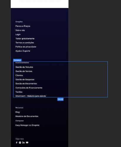
Hey @oscarlima, it looks like your footer content is going outside the boundaries and causing horizontal scrolling on mobile. Try setting “Overflow: Hidden” on the entire section.
Hey! I done that but didn’t fix. Also, the hero image is going to the bottom as you can see at the end of the video I shared.
Can you help me fix both issues?
It must be issue within the overflows of your content on the site:
Try instead of usage px on Width to have width Auto or percentage. and use max. Widths for px instead.
hello I can help you, if you need  send you DM

