Hi team,
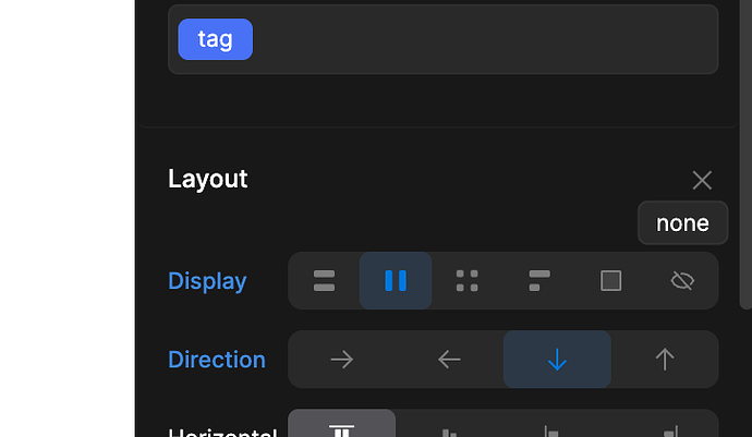
I am trying to show and hide certain images on different resolutions, but when I use the visibility option, the image still takes up space in page, like it still exists there in the document flow, it is just transparent but taking up the same amount of space. So the layout is messed up because of these invisible elements taking up space.
This makes me think that this is either a bug or I have completely not understood how visibility works in Divhunt when it comes to mobile responsive design. I could not find any information at all about how mobile responsive visibility is supposed to work in Divhunt.
I tried to use media queries manually typing out the code in the CSS sections but that does not save, when I reload the page the media queries have disappeared.
Can you take a look and explain to me what is going on and how this is supposed to work?
Screen recording of what I am talking about
-Alexander
