Any idea what I am doing wrong now? ![]()
Inside the builder, it looks fine.
on the website view the words are stacking on top of each other
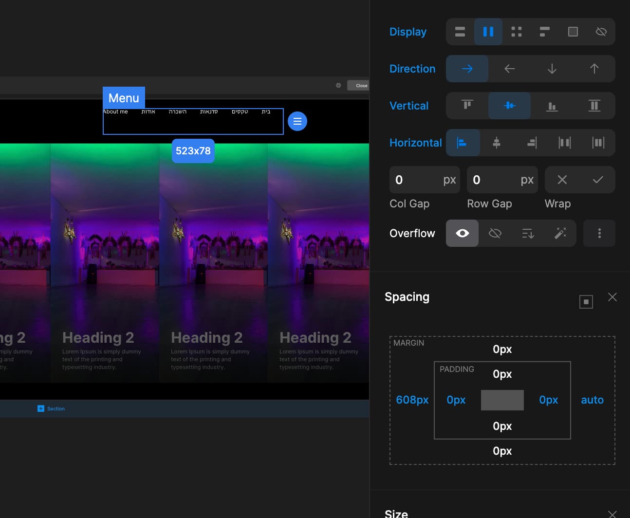
Any idea what I am doing wrong now? ![]()
Inside the builder, it looks fine.
on the website view the words are stacking on top of each other
Using margins for such cases is very bad idea
You should only use margin and paddings to make a space between elements, not to move things around.
Check the video, i’ve fixed it for you:
Thanks a lot!
I bought 3 more licenses earlier today because of your amazing support.
And thanks a lot for the Ronaldo video tutorial!
You explain it very nicely.
These tutorials are a very good way to understand how to work with Divhunt.
All The Best
Thank you for your support as well, means a lot!
Divhunt has a learning curve, and we are lacking some of videos, but I promise we will improve that in near future, until then, feel free to ask any questions you might have.