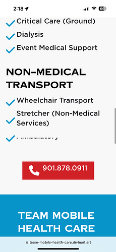
I’m building out this site for a client https://team-mobile-health-care.divhunt.art/ and it formats perfectly on laptop, desktop, and android phones, however, it’s cutting off a bunch of text on the iphone. Attached are some examples, I know there have been some glitches in the past with iphones not showing correctly that y’all have been able to fix. Could you take a look at this so I can get it wrapped up for the client? @Pakic
Your hero section is forced to height of 100vh. And your content is bigger than 100vh, try puting 100% instead of 100vh for mobiles
One part of the issue is solved, but the section with the marquee effect is not showing the same on Android and IOS (not centered and cutting a bit the top of the Span Text):
iPhone:
Android:
Can you help me with that, please?
Its font issue, for some reason iphone doesn’t like Gotham


