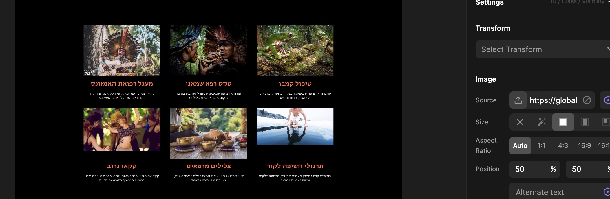
I had to set all the photos of Ratio 1:1 because if they’re on auto, the dimensions are not the same for all of them.
I can’t understand how to make some parts responsive.
Here is another problem with the swiper section,
It looks different in the 480px builder view, on the live view, and on my smartphone.
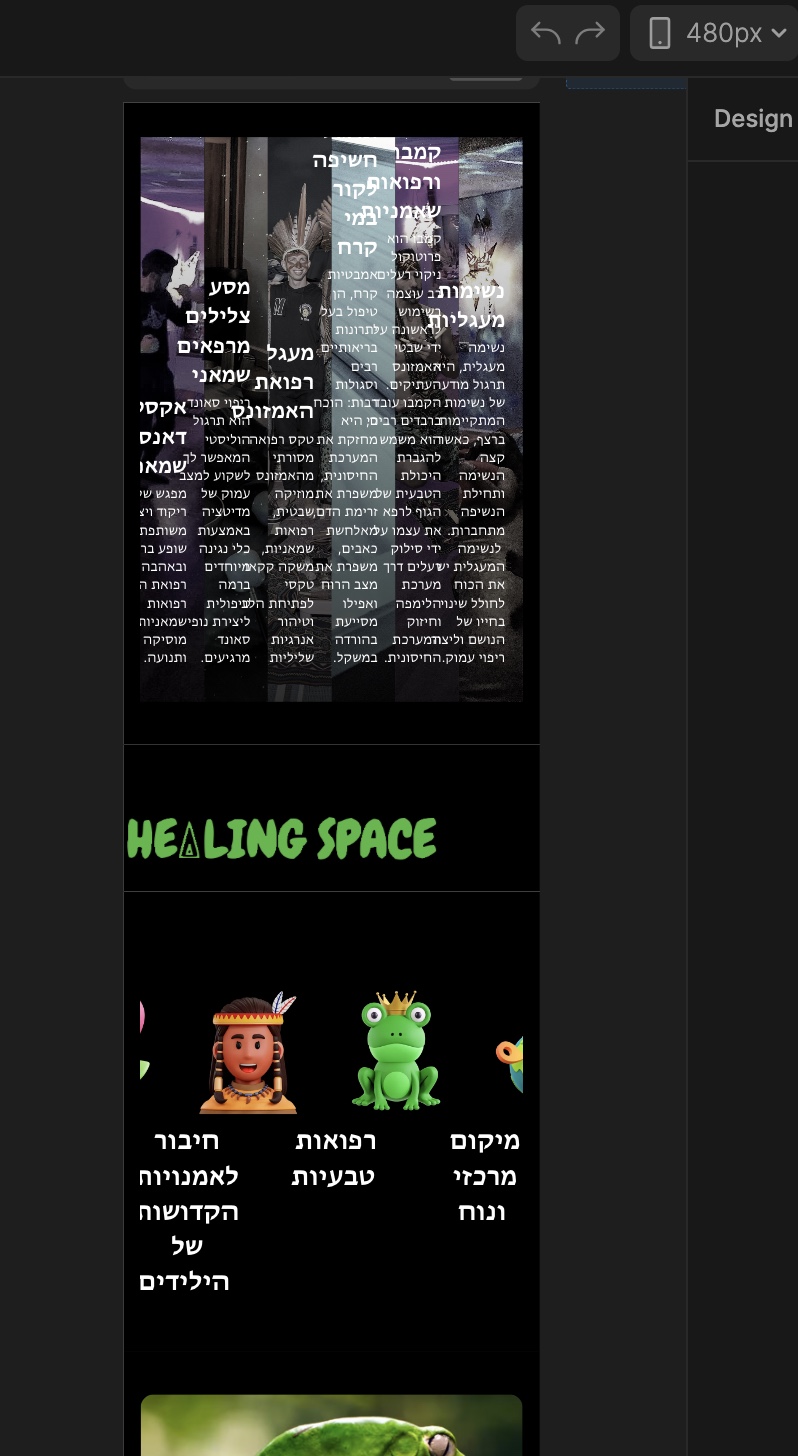

Why are there responsiveness problems like that?
Hi,
We will release a tutorial soon how responsive works exactly, you have multiple problems on your website, first one I noticed is that your text under images has padding-right 200+px, you should never do that.
You should start by removing that 200px padding, and then start from there.
When you go to swiper settings (transform), you have responsive options, so maybe for mobile landscape you can put to be 1 slider per view.
I have fixed it!!!
I made a checklist of the element parameters so I could follow the steps and fix all the problems on the mobile view.
This checklist is a website saver!
Now, I will do the same checklist for an element with Swiper and I hope it will work as well.
Anyway, a video on responsiveness would be amazing!
I have made a post for sharing the checklist for the community and I hope it will help others too
Here as you can see all is perfect in the section that was all messed up.

Hi @Pakic
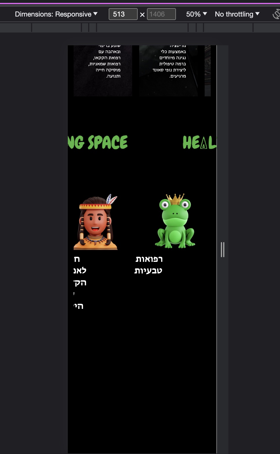
Can you please take a look in this responsive problem?
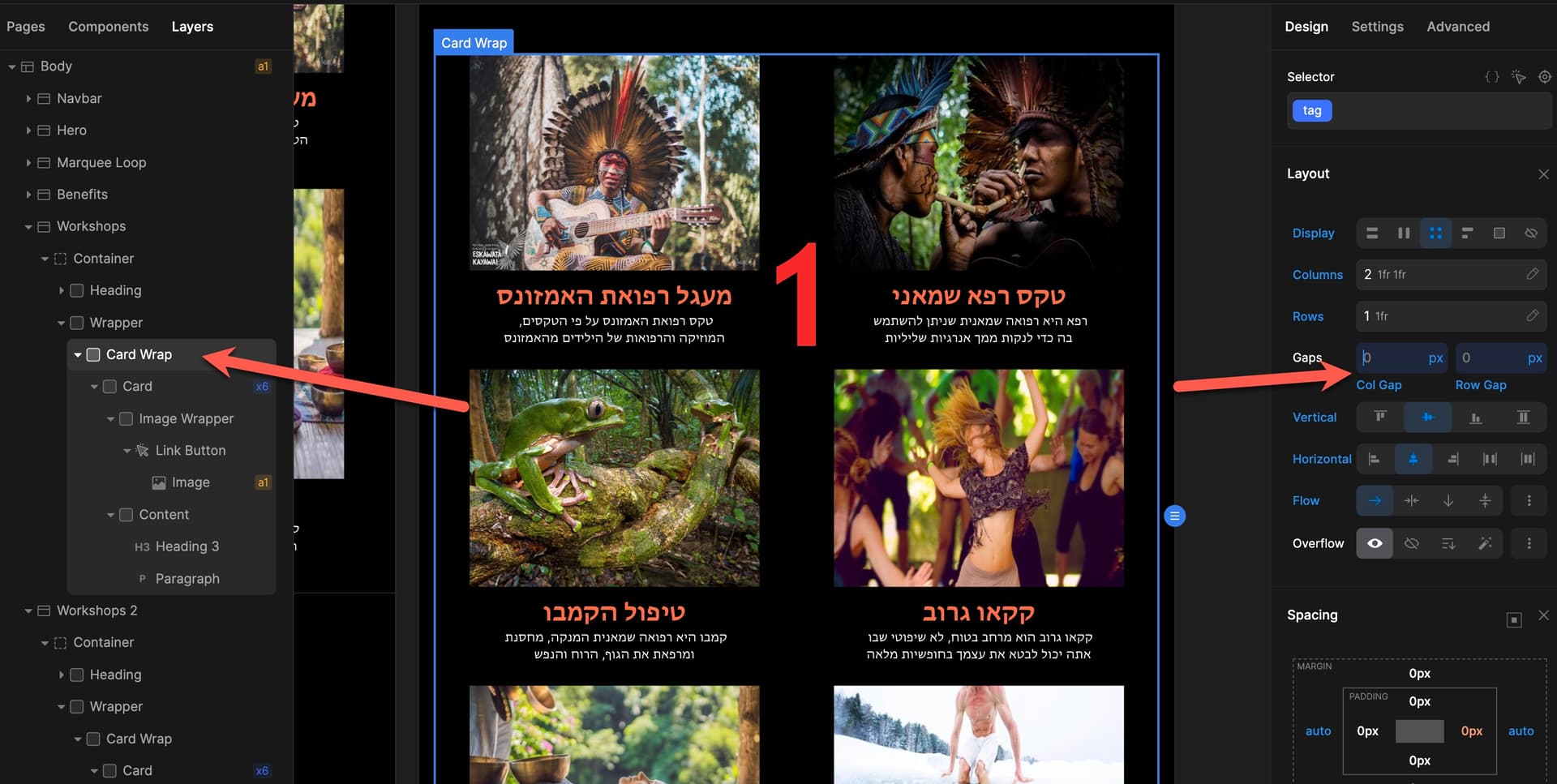
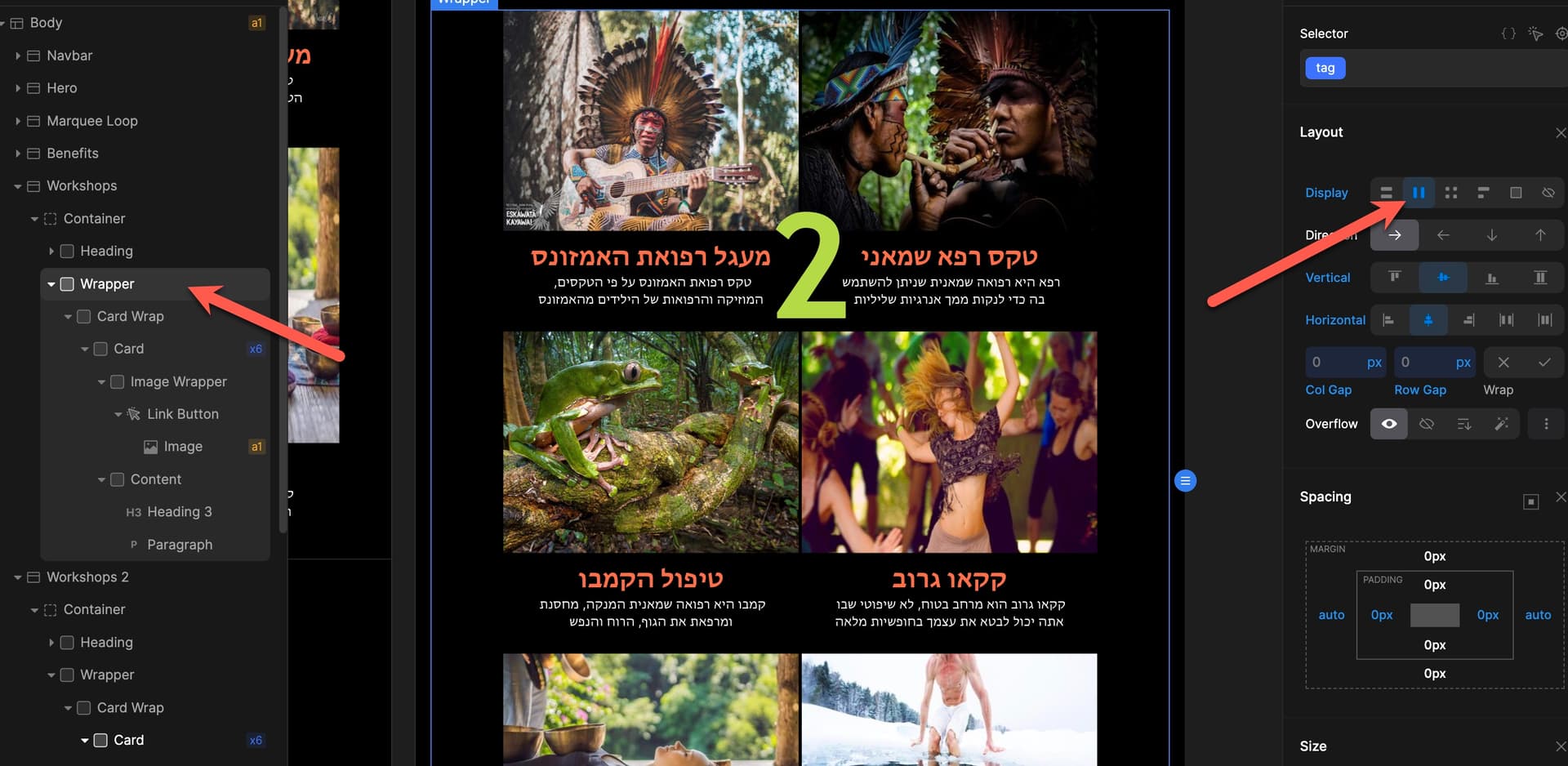
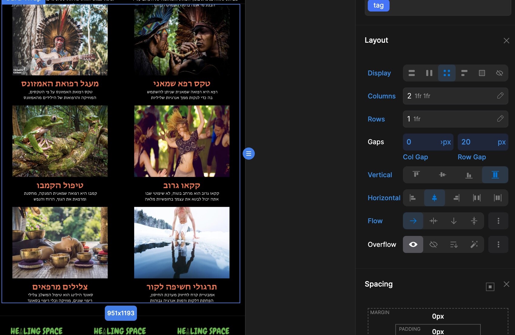
Col gap doesn’t work in breakpoint 991px
It only happens in the tablet view, other responsive views are working fine
Same website
I am not sure where, column gap is set to 0px?
Hi @Pakic
Any ideas on how to fix this problem?
@Pakic
Still couldn’t figure out a fix for it.
Maybe you can?
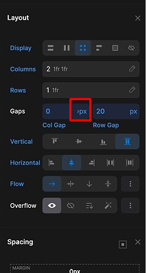
Here it seems to be a bug, try to open that dropdown, and set px again.
1 Like
It’s not that…
I have found the fix and I need you to help me to understand if that is a bug or a configuration needed only for this breakpoint.
I can control the gaps of the “card wrap” div, only if I set a flex display on the parent div named “wrapper”.
Can you explain why only in breakpoint 991px need to do that?
Is that a bug?