Hello, I’ve setup a list of divs with the .logo-size Class.
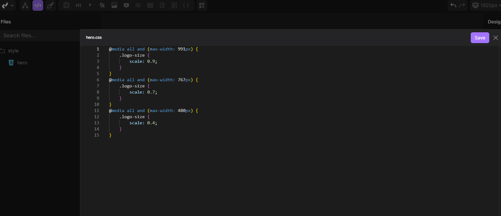
I’ve created a file “style/hero.css” with @media queries modifying .logo-size (see screenshot below).
How can I make this to work?
Hi, you can achieve same that through builder, no need for custom CSS?
But if you want it through custom CSS for some reason, problem is that scale property in CSS doesnt exist. Its actuall transform, so:
transform:scale(0.7);
Humm,
So it’s probably worth it to explain what I wanto achieve for you to provide advice.
I’ve created a logo with a set of div (look at tei.divhunt.art).
Now i want to change divs sizes to fit better with screen size.
Does reviewing these sizes when selecting different screen in the builder is the way to go?
ok that’s the way to do.
Done!
The first solution (using files), that could work too, but that code is only executed on live website, not inside builder.
1 Like
Hi @Pakic,
I’m new to the platform and have web-dev experience.
Can you please explain how to create media queries without custom-code or creating classes?
Right now when I create an element in the desktop breakpoint, it seems all other break-points inherit the CSS for this breakpoint? Is this meant to happen or should a media-query automatically be created when I change the CSS in another break-point?
Is there a way to tell if the breakpoints are min-width or max-width (ie desktop-first or mobile-first)? And if so, is there also a way to change it? I prefer to work desktop first since most of my traffic is from desktop.
Thanks!
Hey @AlwaysBeLearning, it is working the Desktop first and then below. That means that all the changes you are creating on the Desktop default breakpoint (1920px) will be applied there and on all the breakpoints below it until you change them manually on a smaller breakpoint.
So let’s say you set a font-size: 48px; on the 1920px breakpoint, it will keep the same size on all the smaller breakpoints until you change it on the smaller one, like 991px or so.
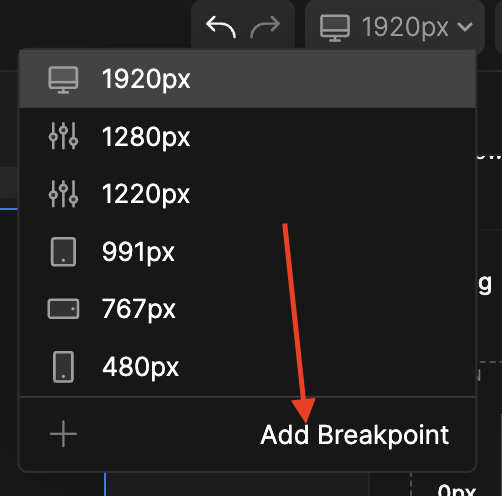
If you want to add the custom breakpoint (for example 1440px, 1280px, or anything else), you can do it here:
Hope this helps, let me know if you have more questions!
1 Like
Just to add one more thing regarding the comment above, to be more clear, it’s working “current + below” for every breakpoint. If you set the new font-size on the 991px breakpoint, the breakpoints below it (767px and 480px) will inherit that font-size until you manually change them on the smaller breakpoints.
Thanks for the reply, that’s really good to know.
Is it possible to change the default breakpoints or hide them?
I prefer to work with Tailwind’s breakpoint sizes.
And just out of curiousity what are the current default sizes based on (is there a design standard )?
Thanks!