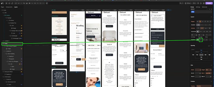
Hello
I have a problem with responsive on my macbook pro 13’
I build my website on my computer with screen in 27’, and when i would like to show the website to my wife i saw not responsive on the macbook pro 13’
It’s very strange, i add breakpoint pixel on DivHunt, but i cannot find the correct pixels number for reproduce macbook pro 13’ screen…
I tried with 1440px but not the same on my macbook and divhunt builder
Someone now which breakpoint i must to put ?
Thx
Hi,
On video below I showed you how you can check if your website is repsonsive all on all resolutions, and you can create custom breakpoints in order to make it perfect everywhere.
1 Like
Thanks for sharing this video @Pakic
But i think you have a little problem between your builder and publish website
I did video for explain the problem
Your builder don’t have the same website size in preview builder between the real website in publish
thanks
And on mobile size 390px it’s the big problem
Please check my video
