📢 This forum is no longer actively updated, but we've kept it online as a resource — there's a lot of helpful history here! For new discussions, come join us on
discord!
I am getting lost in trying to understand how the hamburger menu works.
In my website, I have:
1- a yellow section that disappears when scrolling down (newsletter subscription)
2- a navbar (defined as a component and reused below)
3- a sticky navbar that appears on scroll
This config works fine on desktop views.
But when I try to configure the hamburger menu in mobile views:
a. the panel with the menu does not appear correctly (not sure what the config should be)
b. when I manage to make it appear, it does not stick like the sticky navbar does (I tried to apply config as shown here, but without success: Hamburger menu to fill up the entire height - Questions - Forum | Divhunt)
I managed to fix the problem; here is what I did and list of important elements to consider:
I have removed the sticky navbar with appear on scroll transformation. Instead, I could acchieve the same only with one navbar configured as described below
I have configured the navbar and created a “sticky” class applied to it. The section is directly in the body, with position sticky 0% on top and Z-index 9999. This config is then enough to have the first yellow section disappear while scrolling and keeping the menu on top.
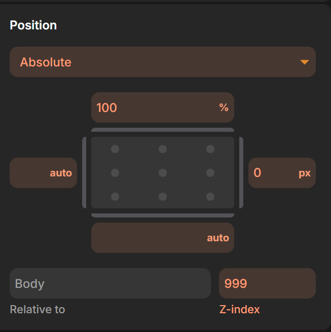
here is where I could correct the mobile view menu: the navbar is composed of logo, menu and hamburger. The menu div has to be hidden in mobile views, with position absolute 100% on top, and I placed it on the right side of the screen, hence 0px on the right.
