I am trying to make my website responsive for Desktop, Tablet and Mobile.
I managed to follow the approach mentioned here with top down approach of going from desktop to tablet then to mobile, however the changes does not reflect in the live link (Screenshots attached)
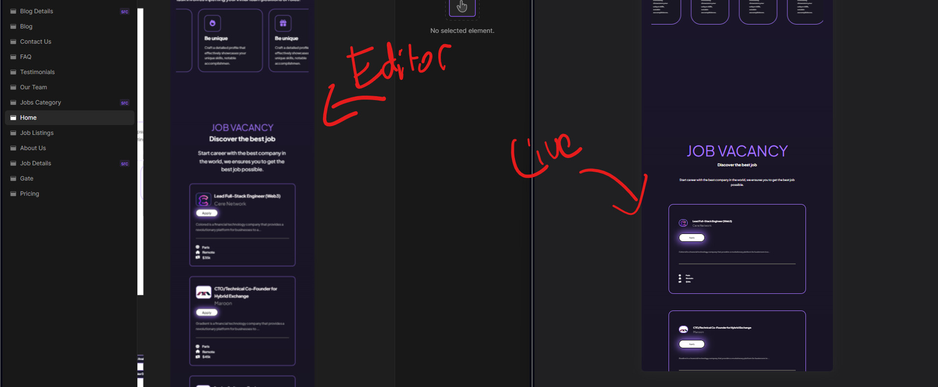
You shouldn’t be using font-size in vw units. Currently our builder is creating incorrect visual version when you are using vw, while live website is presenting that correctly, we will work on this in future.
I would suggest using pixels as the easiest to use unit in the web development.