My website displays fine on my laptop, but not my mobile (even tho it shows on the mobile aspect ratio on my laptop).
Any idea why?
My website link is: https://pilates.divhunt.website/
Thanks
Maybe you haven’t published the site? That’s why you see it on a PC, since you are logged in to the system, but on a mobile device you are not logged in.
I see a white sheet from the PC
Thanks, rookie error.
Published
Thanks, fixed, but I notice top menu does not show on mobile
@Sculler you have to install hamburger plugin from plugins. If it’s installed but not working, reinstall it(that was my case).
Thanks, I did have it installed, so I uninstalled & reinstalled.
Now my (dark) menu for homepage works fine, but my (light) menu that I created & use for other pages does not show.
Can you provide images so we can easily understand what is going on and what do you mean?
Menu/nav bar should be use as a component- You should have had one menu bar for all pages that is component and transform according to the size of the screen.
If you use element from divhunt library it will work as it should be.- make it a component and ad component field on every new page.
The same about footer of your website and other elements that you use more than one time
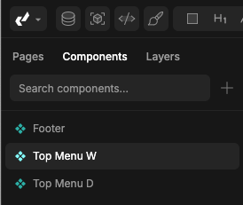
I have created 3 components.

Footer (at bottom of all pages)
Top Menu W = Menu for light mode pages
Top Menu D = Menu for dark mode pages
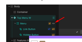
Hamburger was set to display none as layers are indicating?

Thanks for the help.
Sorted now.


