I obviously want my site to look equally as good on all devices - how do I properly develop a responsive site in Divhunt?
Of course!
In Divhunt, everything follows a top-down approach. This means you start with desktop, and work your way down the pre-set and/or custom break points
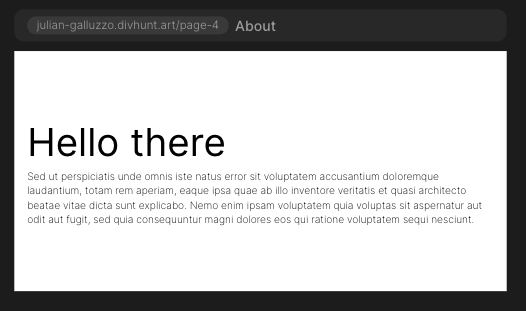
For example, I’ve developed this section here:
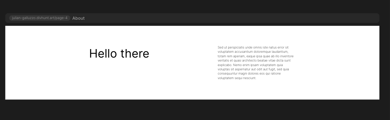
On desktop, this looks perfectly fine. Now, let’s work our way down.
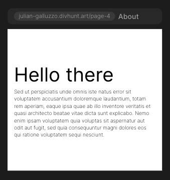
Here’s how it looks on tablet:
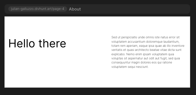
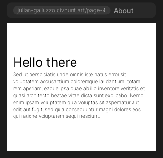
Still good, so I won’t make any changes here. Let’s make our way down to mobile landscape:
Now this looks too close together - so I’m going to head to the styles panel, change the flex direction to vertical, and remove the max width from the paragraph.
Let’s take a look:
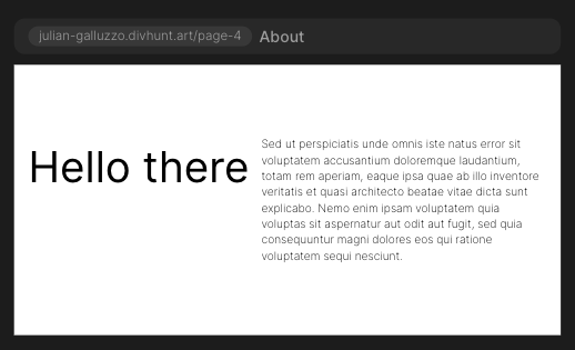
Ah, much better. And finally, let’s take a look at mobile portrait:
It’s pretty good, but I think the header is a bit too big - let’s reduce the size to 40px:
Wonderful! Now, everything looks exactly as I want it to on all device sizes.
While this is a simple example, it covers the basics of everything responsive design in Divhunt!
1 Like
Is there are way to start with mobile design first and have the cascade work the other way? IMHO this is something webflow got wrong since mobile traffic past desktop traffic a long time ago --it makes sense to prioritise building the mobile site first.
2 Likes
This is a really great idea to consider - I think the reason most builders do desktop first isn’t because of any priority, but because it’s easier to rearrange lots of things to fit a smaller space than it is to fill up the empty space you would be left with if you took a bottom up approach.
That being said, you’re completely right - overall, mobile traffic is far more significant than desktop traffic these days, at least on B2C sites.
I’m going to put this idea in the roadmap and see what we can do - thank you for the suggestion!
1 Like
Could you do a simple explanation like this for Grid layout instead of flex?
I have never used Grid before, but now that it is an option in Divhunt I would like to try it. However I am finding it impossible to do a simple responsive design using the Grid options. I tried switching from two columns in desktop to one in mobile, but everything aligns left, no matter what I try in the design section of the interface I cannot get things to center align. Googling for Grid related help gives CSS, but I would like to learn using the Divhunt interface.
Hi,
We will be making a tutorial on how grid & flex work, including responsive soon. We will post it on youtube, and I will send you a link here when we publish it.
2 Likes
Great, will look out for that, thanks.
Heres a tutorial on grid that we released today:

2 Likes
Nice one, thanks for letting me know 
1 Like
Where can we find the following?